PULLMAN BERLIN SCHWEIZERHOF
Berlin, Germany
Opening date: 2017
The Gold Key Award as the Best Lobby Upscale 2018
Annual Hotel Space Award by the 16th International Design Media award 2018
The IHIF HAMA Europe Award in the Value Add strategy category

Area: 1000 m2
Did you know that…
The hotel district was originally business-oriented but, moulded by the hands of time, transformed into a popular scene for young people due to its numerous parks, design hotels and trendy shops, which have appeared in the neighbourhood since 1998 (when the building first appeared).
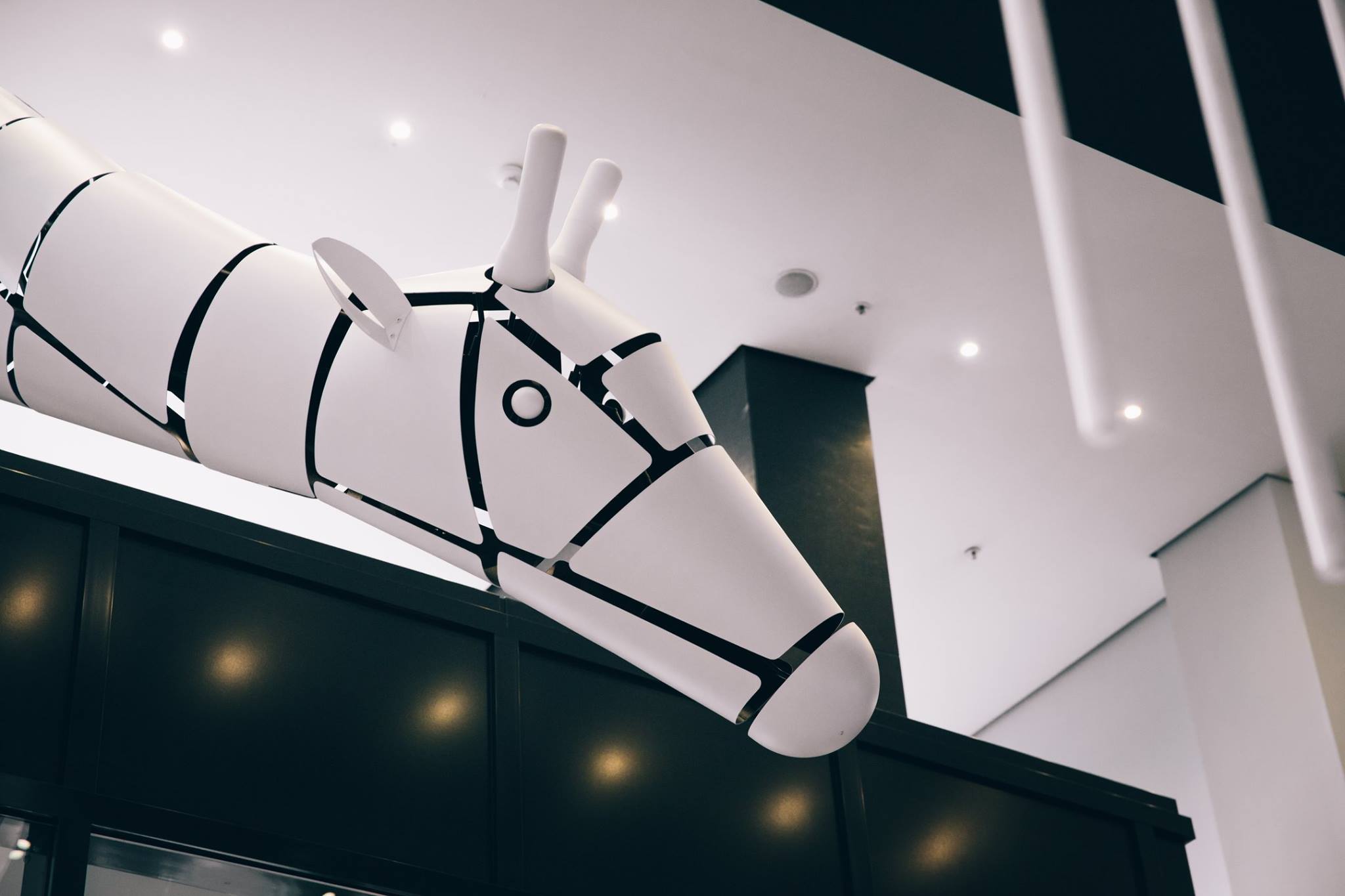
We never separate the object from its locale. It isn’t easy to spice up such a vibrant and creative city as Berlin, yet the location combined with work for the concept’s benefit. Located just across the street from the city zoo, so we decided to play with that. The new Pullman Berlin Schweizerhof has adopted some of its pets and dressed them in Bauhaus – the style has dominated in architectural design in the first half of the 20th century. Sticking to the movement’s main principle, defined by Ludwig Mies van der Rohe as “Less is more”, we made functionality a priority.
Reflection in Our Design
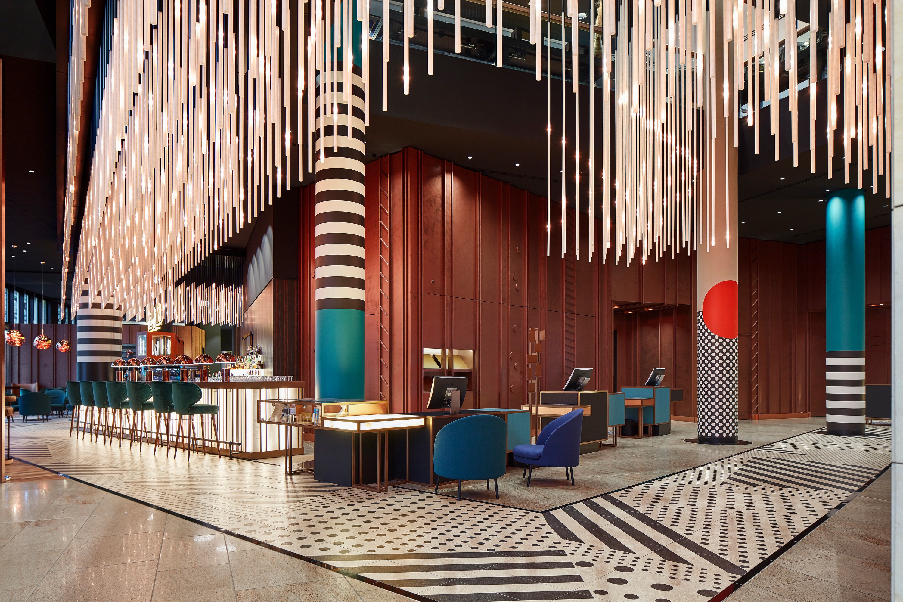
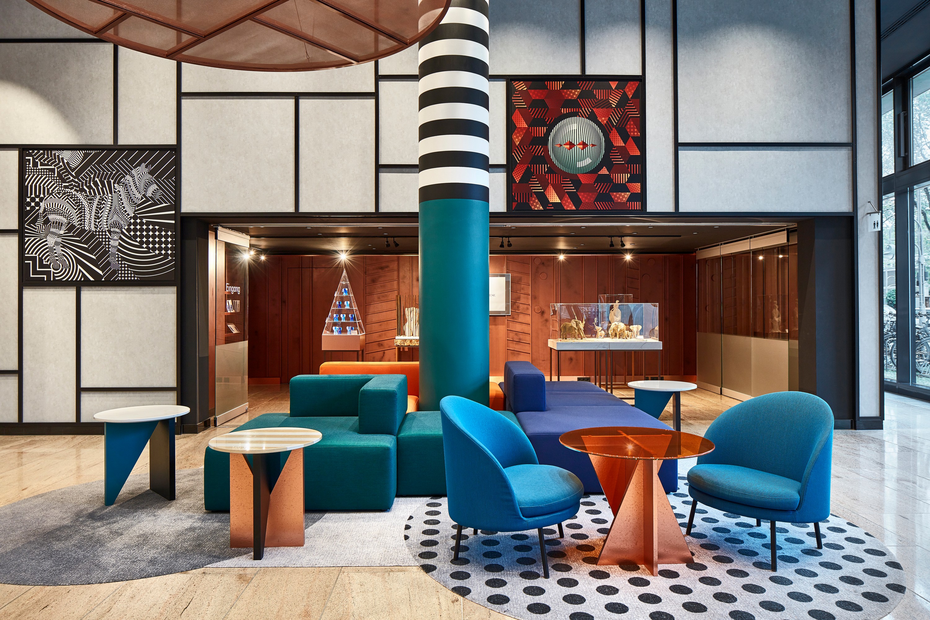
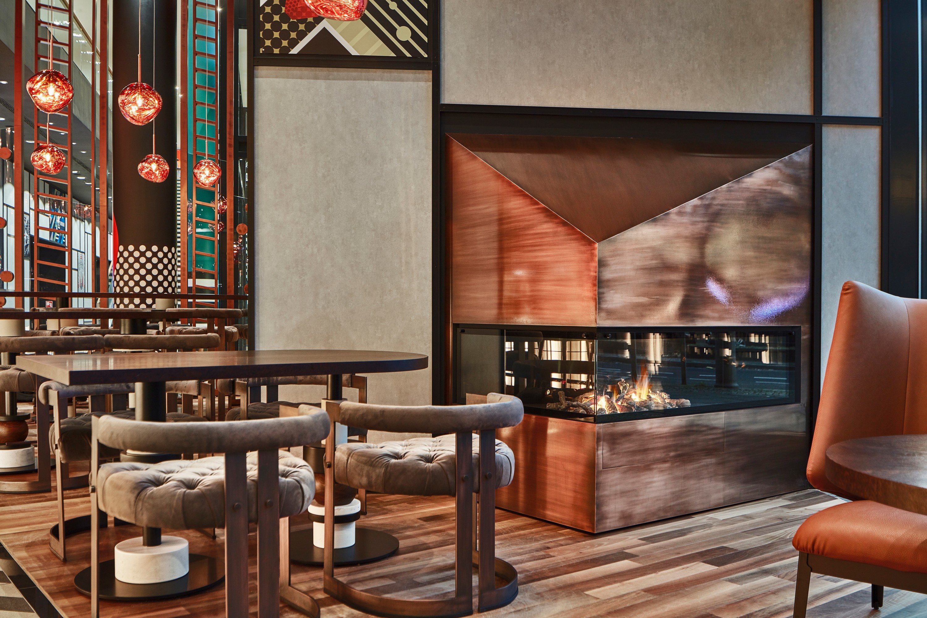
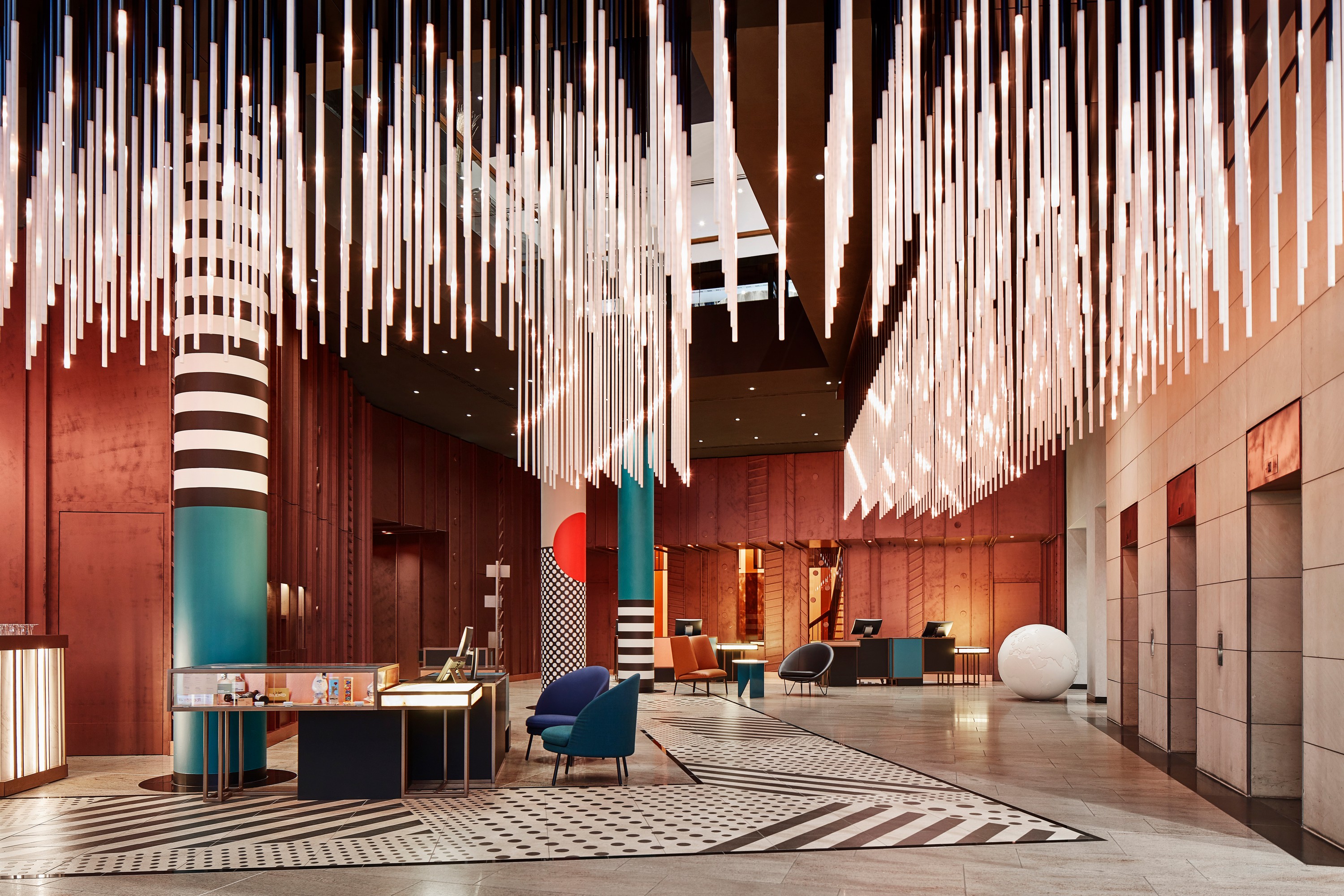
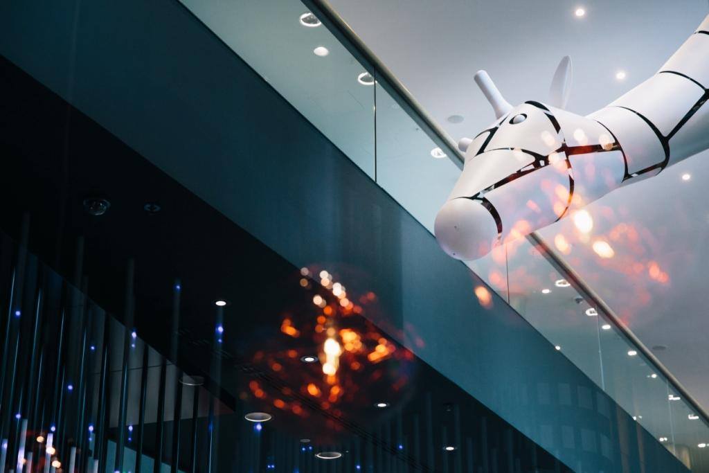
Zoosana, the giraffe, greets guests and passersby at the main entrance, yet reaches out its curious neck into the hotel lobby, overseeing all the action. Here, refined materials such as leather, copper, marble, onyx supplement the strict geometry of Bauhaus shapes and basic colours, creating a unique and cosy space.
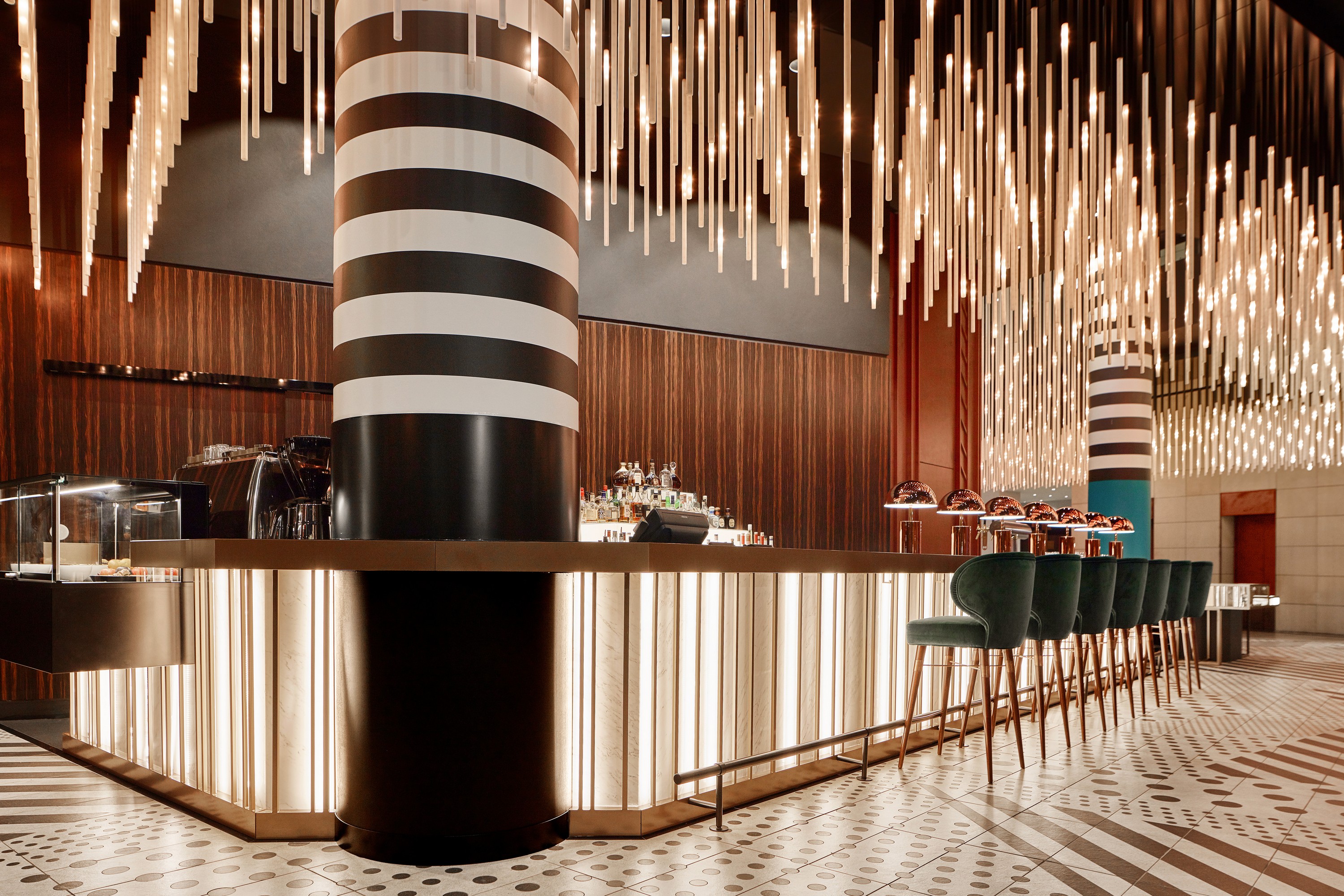
The ceiling works as a functional objet d’art: it mesmerizes guests and passersby from the street while enveloping that inside in a warm and soothing atmosphere. It’s interactive, too, and may be used as information or an advertising screen on various occasions, while continuing general style patterns in basic daily hotel life. On a more practical note, LED lighting not only helps to drive down energy costs and consumption but allows to reduce maintenance and cooling costs as well.
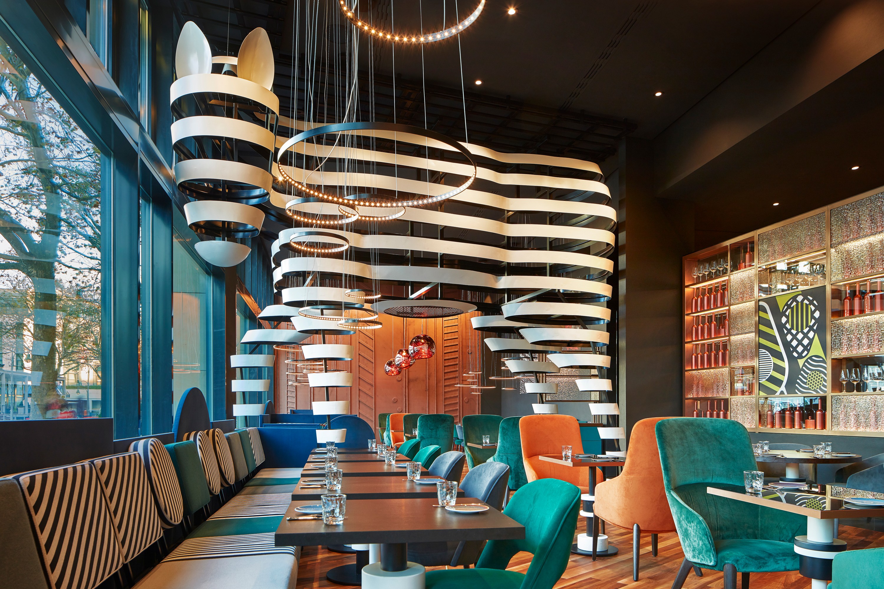
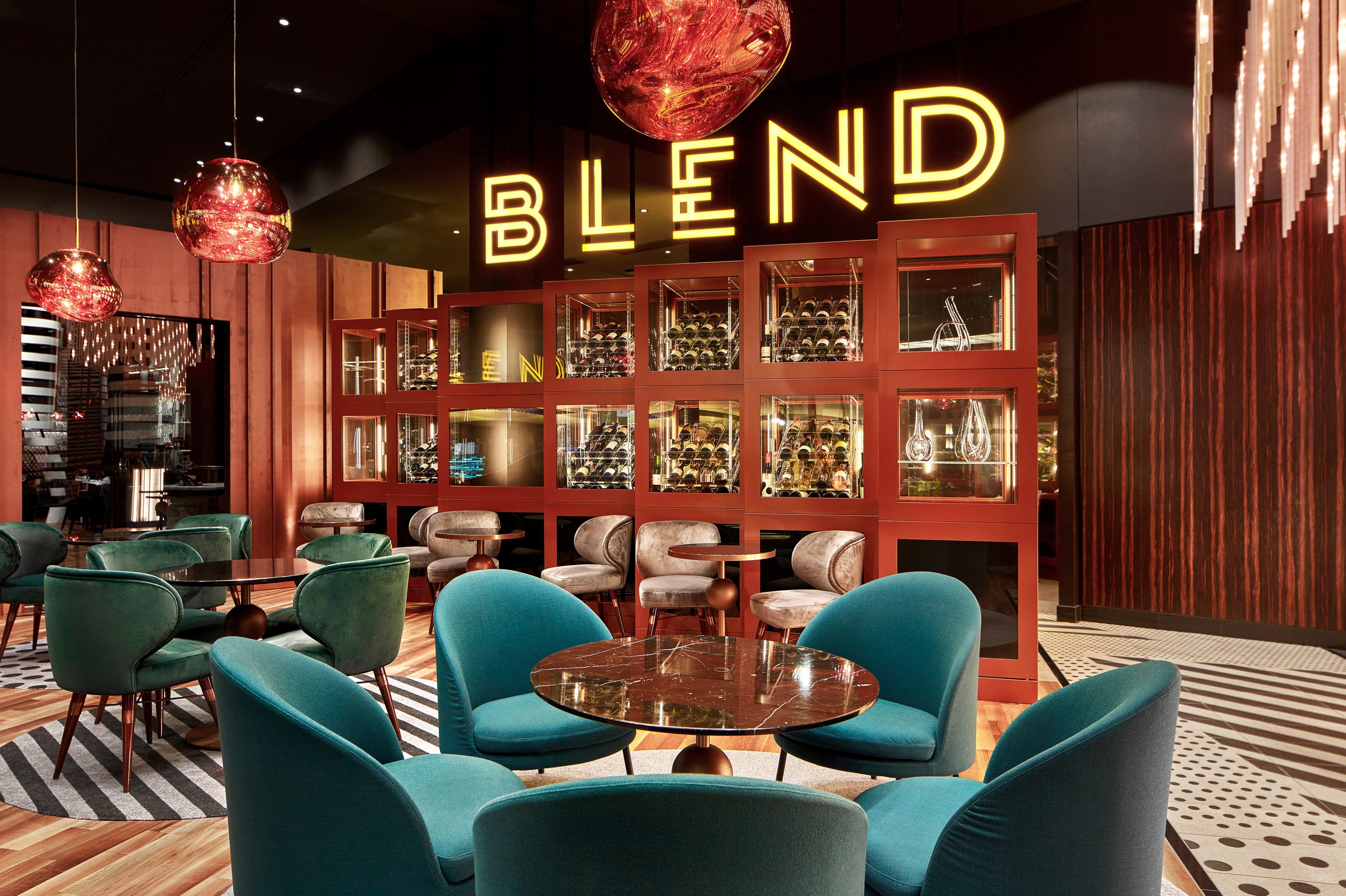
The patterned stripe on the floor is not only an attention-grabbing design element but serves a navigational purpose as well. It leads the guests from the entrance to the reception, and from there to the real place of interest – along the bar and to the restaurant, where zebra Blenda is always eager to blend a friendly cocktail hear you out.
Key Points for Rejuvenation
One of the main conditions set forth was that the hotel remained in operation. So, work took place in stages, one zone after another and 6 in total. We had to keep in mind the existing utilities and finishes, yet at the same time re-think the layouts and interiors of public zones completely.
Being wizards with experience, we knew just which tricks to perform to increase the flow of guests into the restaurant. Trick one: unite the restaurant and bar zones. Both are now visible from the entrance and the lounge. Trick two: add a wow factor. An oversized zebra made up of Bauhaus ornaments, for instance, is a sure attention grabber for casual passers-by to share a drink or a meal with the friendly creature. Voila! There’s your guarantee that the restaurant will work as an independent venue, serving an audience much wider than just hotel guests.
We have changed the layout slightly, yet intelligently. No wonder, that the sad deserted bar had not attracted visitors before the renovation. Placed in the lobby’s heart and visible, at last, in all its splendour, the central element could now work its magic on the audience from the street, thus raising the hotel’s profits significantly.
We repositioned the reception desks closer to the entrance, creating a greater sense of hospitability and accessibility to guests, which also proved to be more convenient for personnel.
We blurred the boundaries between the outside and the interior and created an artistic space, which unites hotel guests and city strangers in their search for freedom and encourages their desire for self-expression. The timeless combination of ZOO themed objects and German Bauhaus style elements feel so in place here, that will no doubt stay relevant for at least another decade.
The Team:
Design by Irina and Olga Sundukovy
Photo by Maarten Willemstein
