COMMUNITY
Opening date: 2017
Photo: Nikita Kruchkov
The Gold Key Award as the Best Casual Dining 2018
Task
To create an interior for a new concept of a location that used to be a club. To combine the various zones – a theater, a restaurant, a tea room, a bar, and a room for master classes – into a balanced single multi-functional space.
Challenges
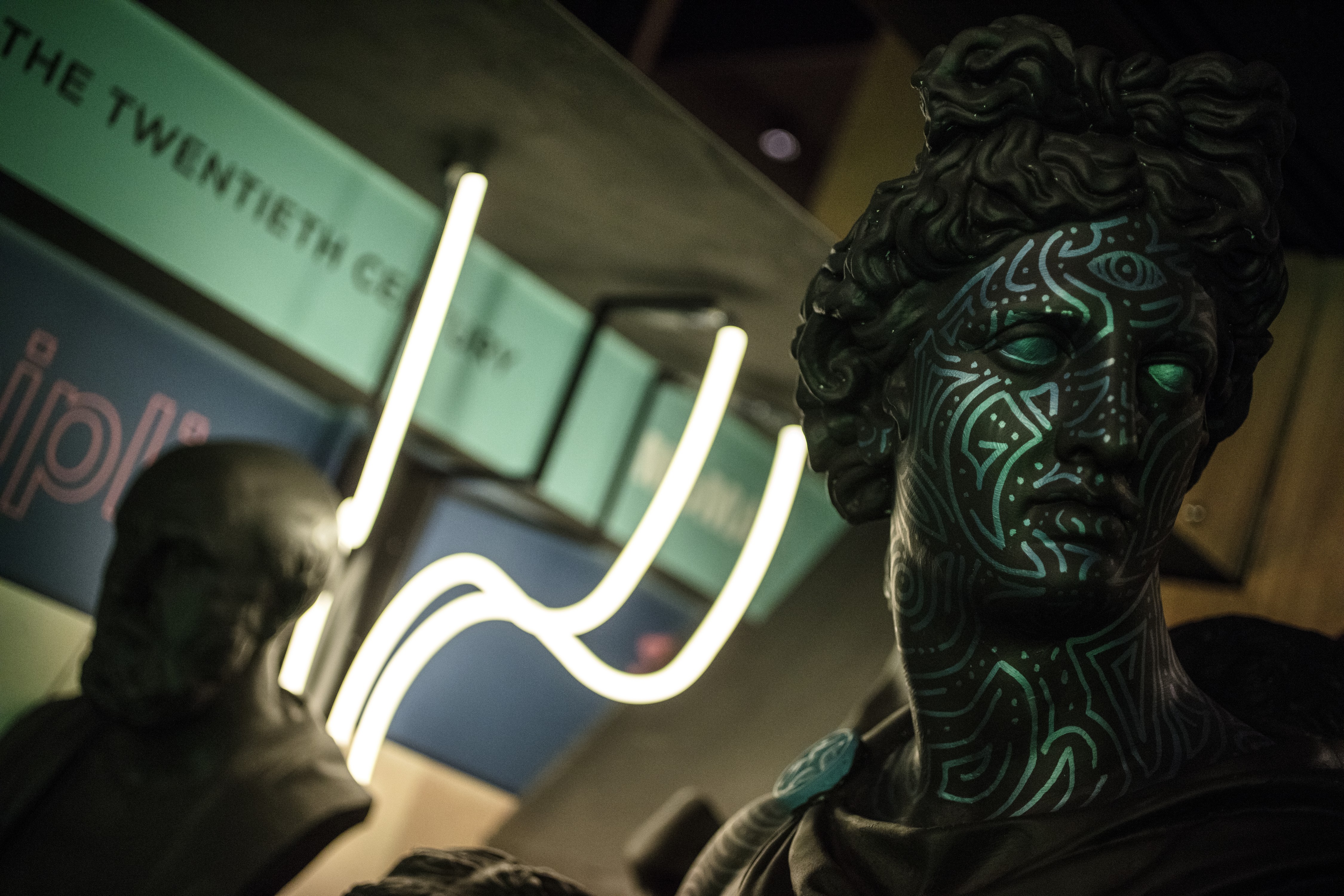
It was necessary to include objets d’art in the interior, and to come up with a way to combine all the zones. Moreover, Community is located in the building of the State University for Design and Technology. Having such a creative neighbor also sets a vector of its own: it was important for us to surprise and inspire the guests, many of whom are somehow connected to the world of design.
Idea
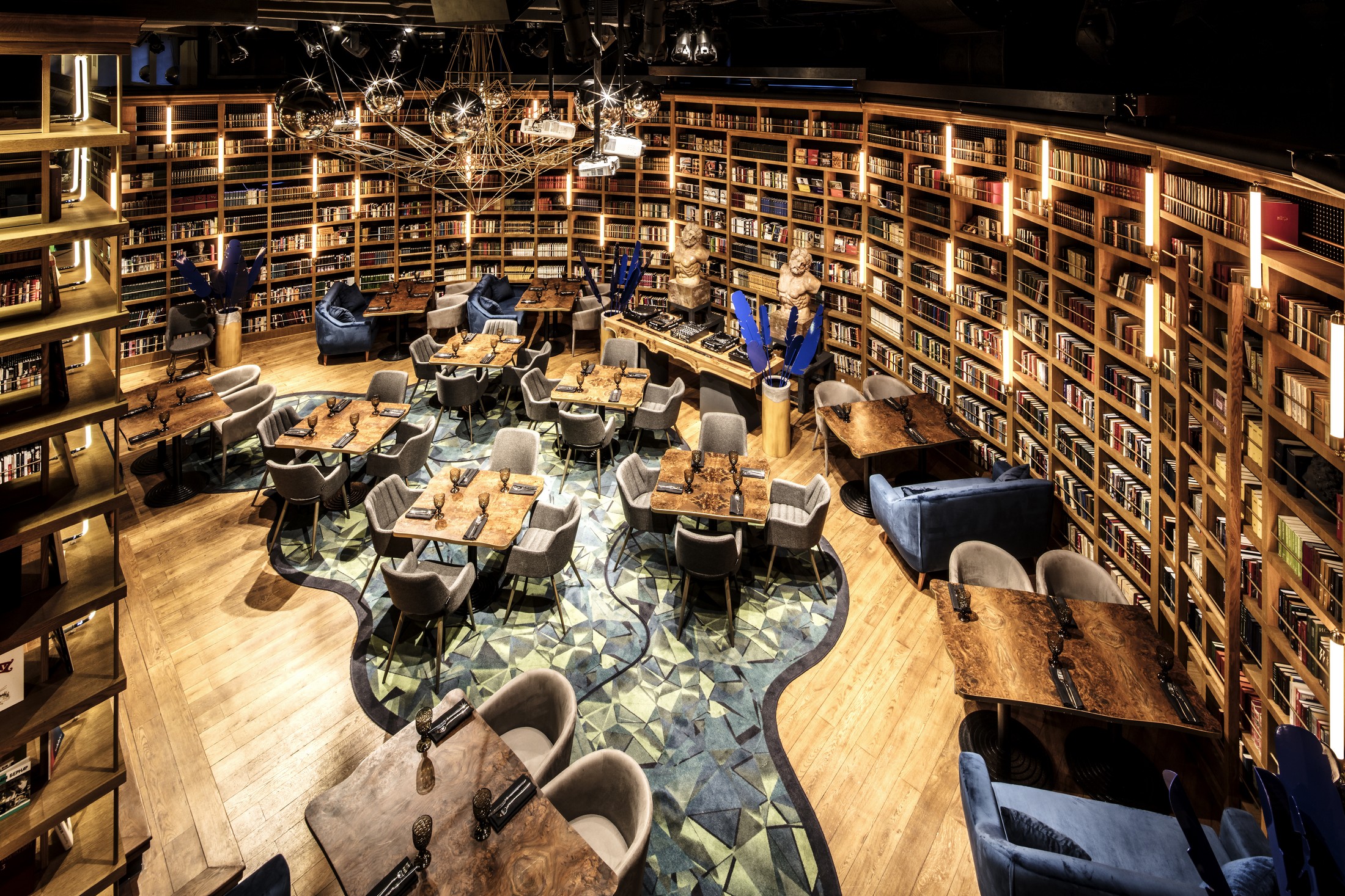
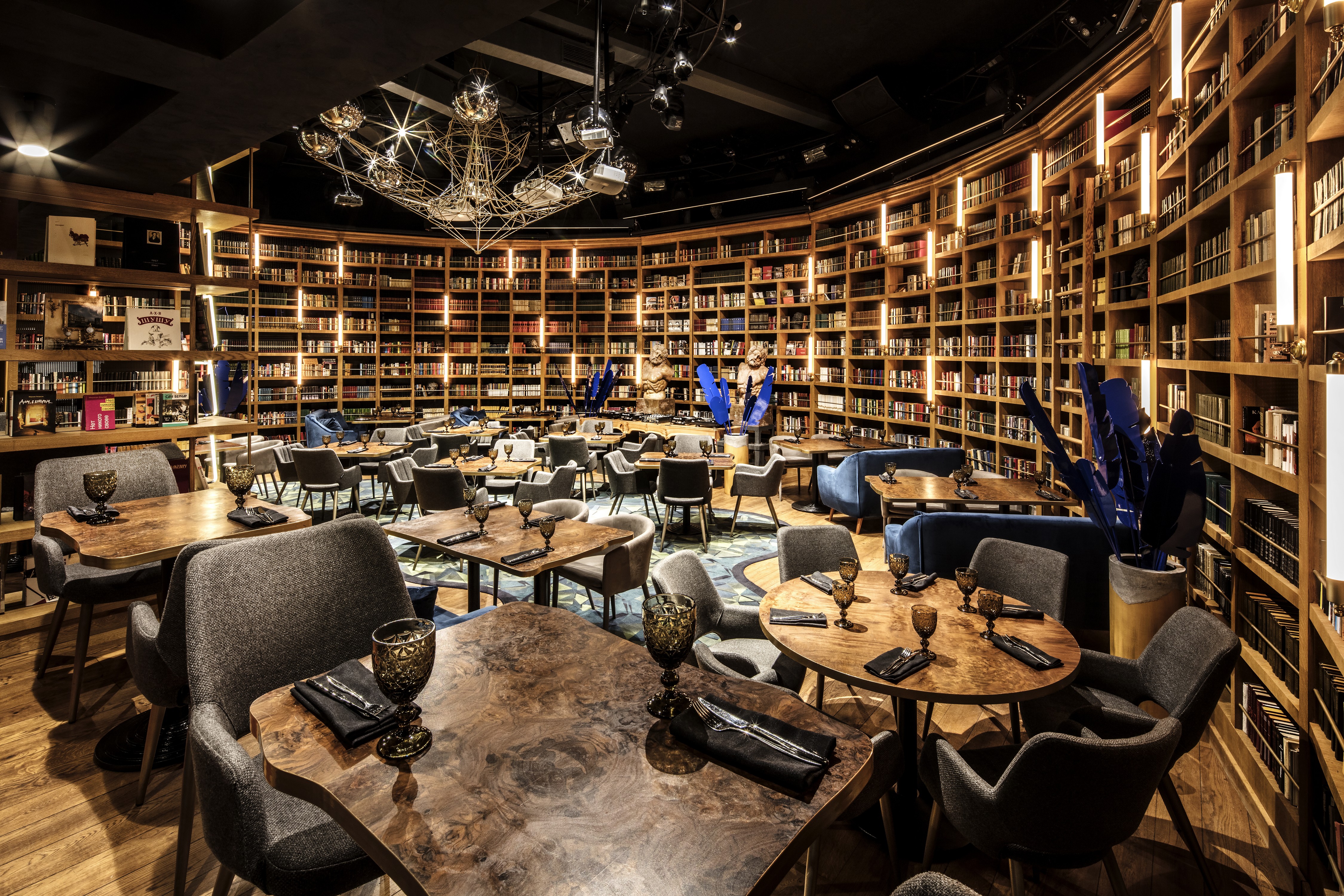
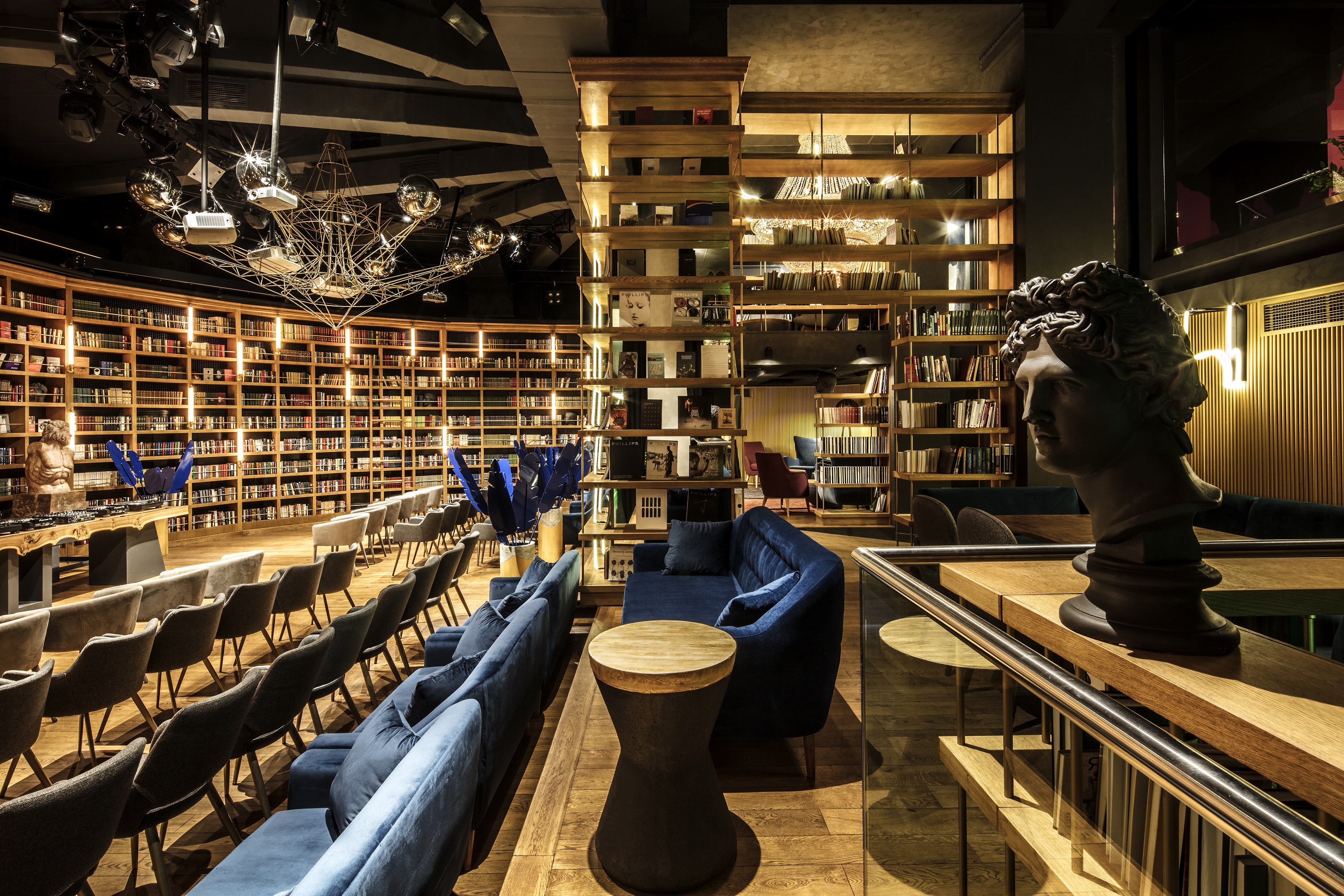
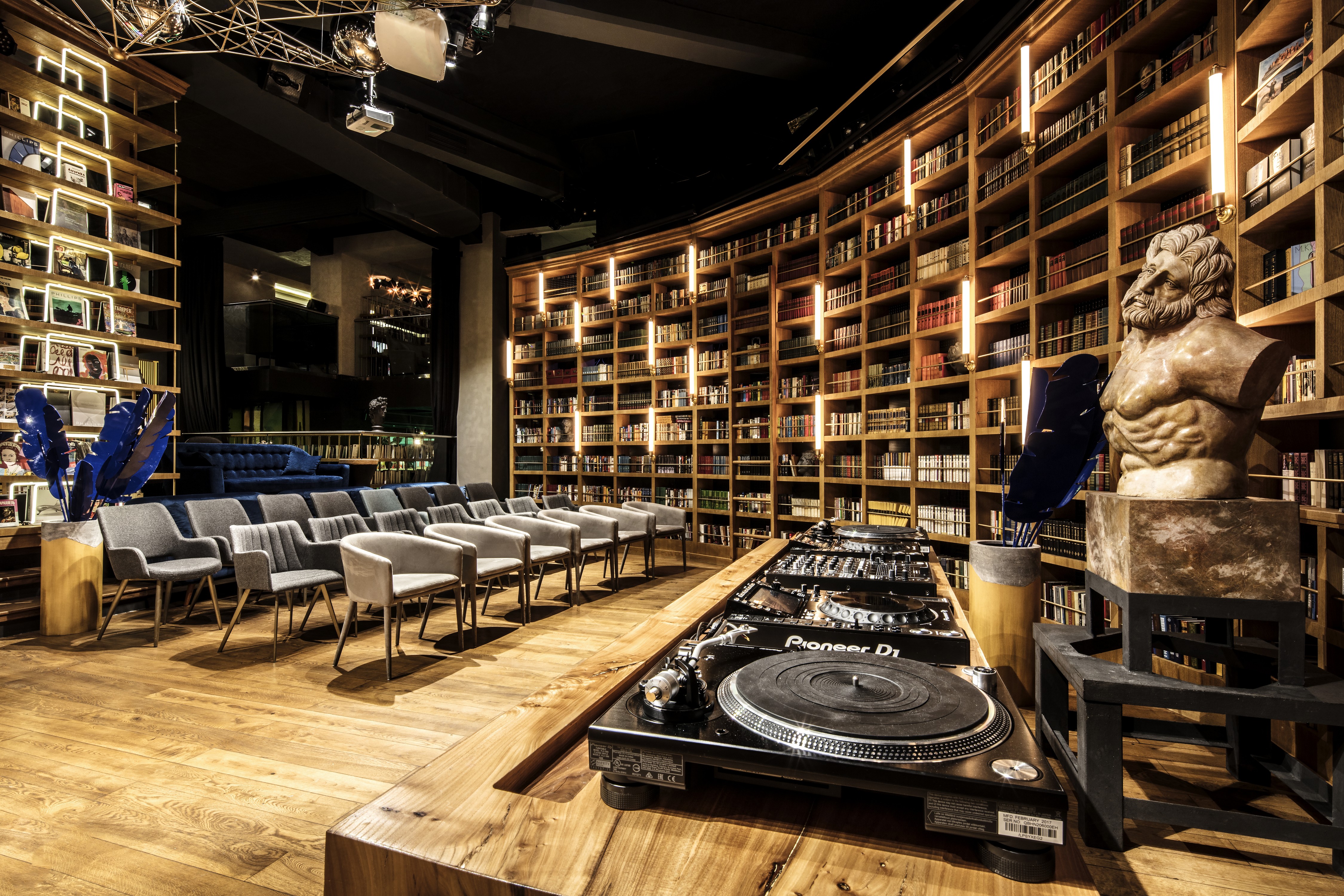
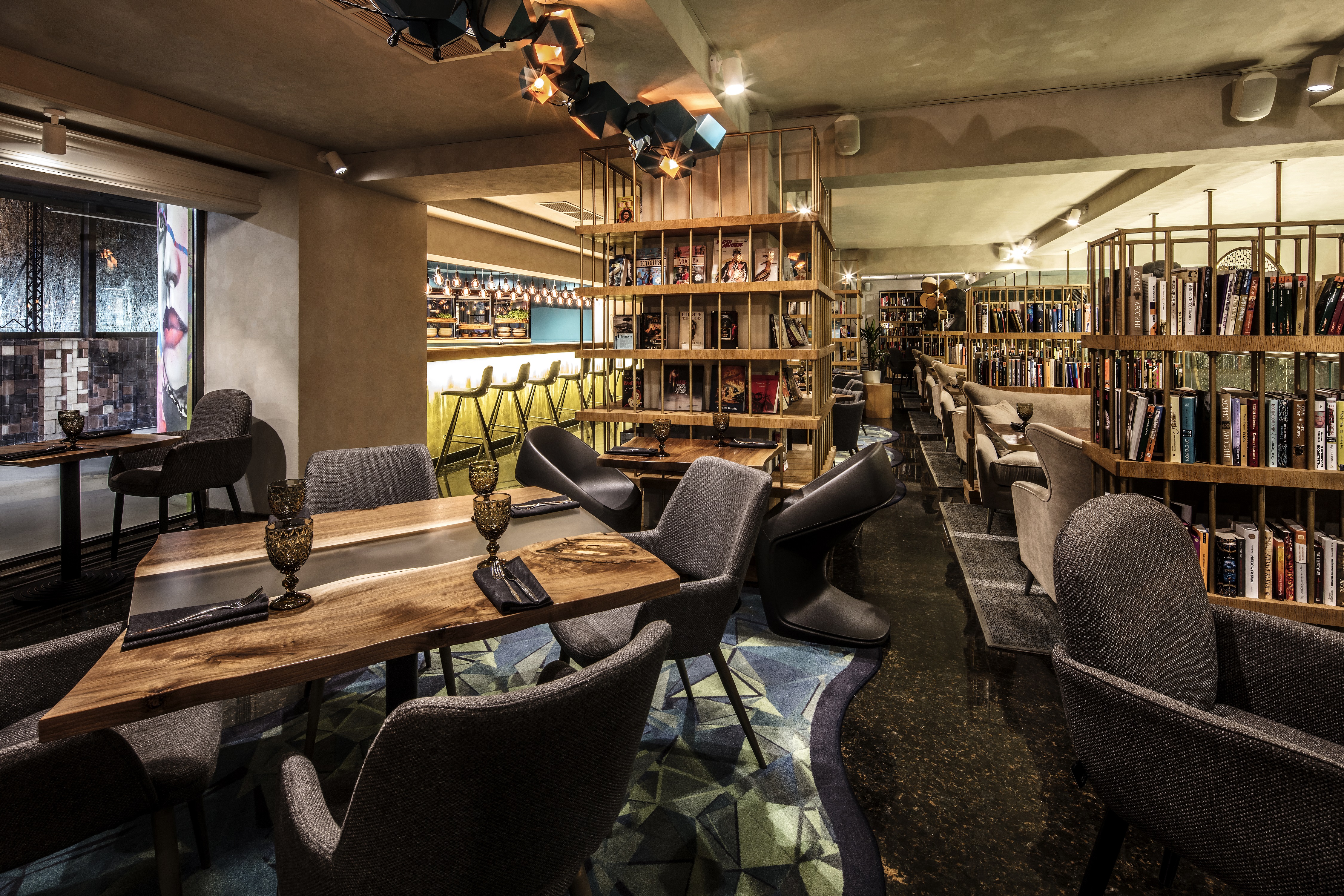
We brought the various zones together by implementing elements of décor that differ in functionality and color, but are in tune with the main theme of the space – a library. Firstly, a library hints at the proximity of an educational institution. Secondly, a library has always been an actual community, bringing people with different interests together in one space.
Solution
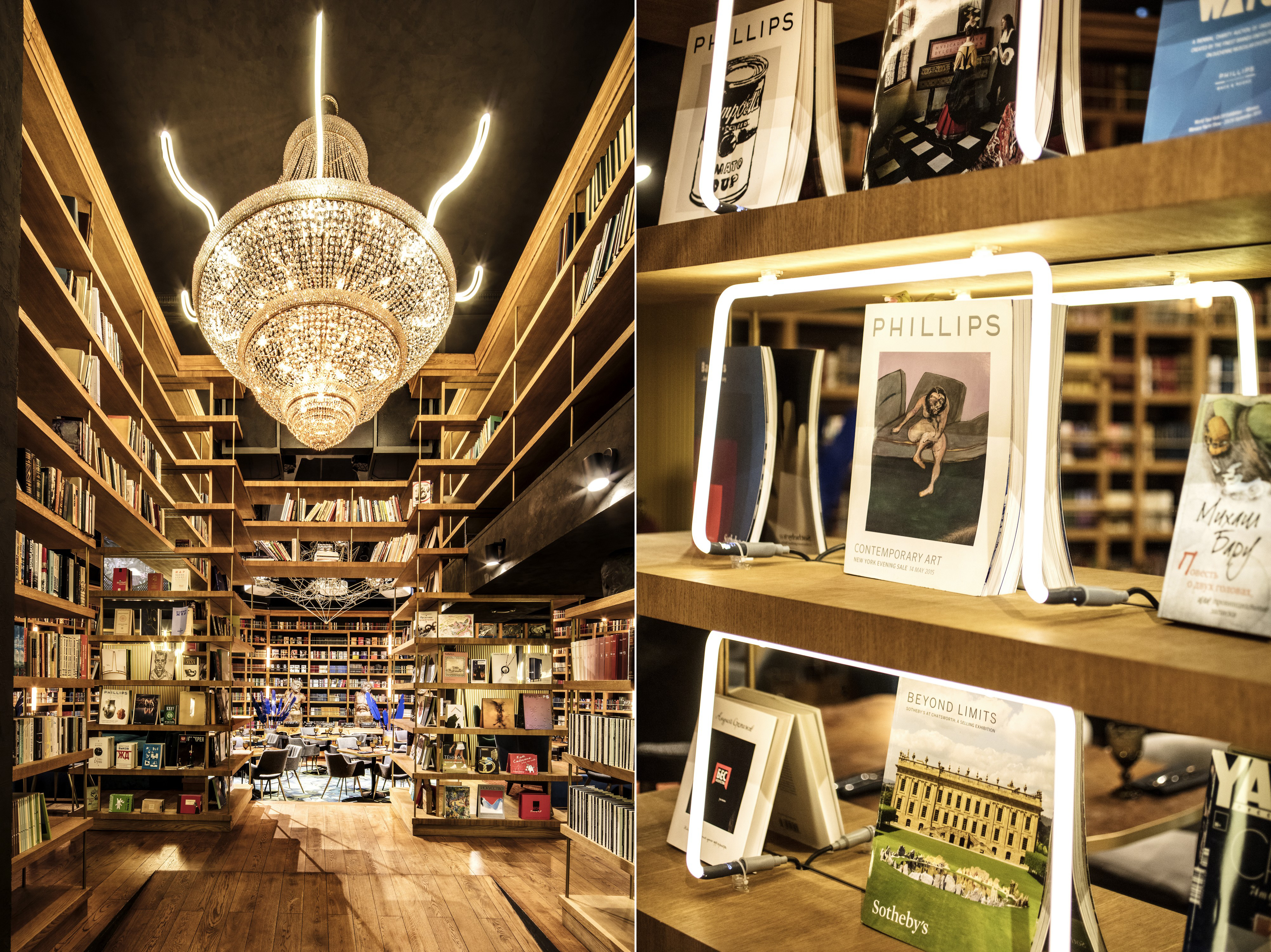
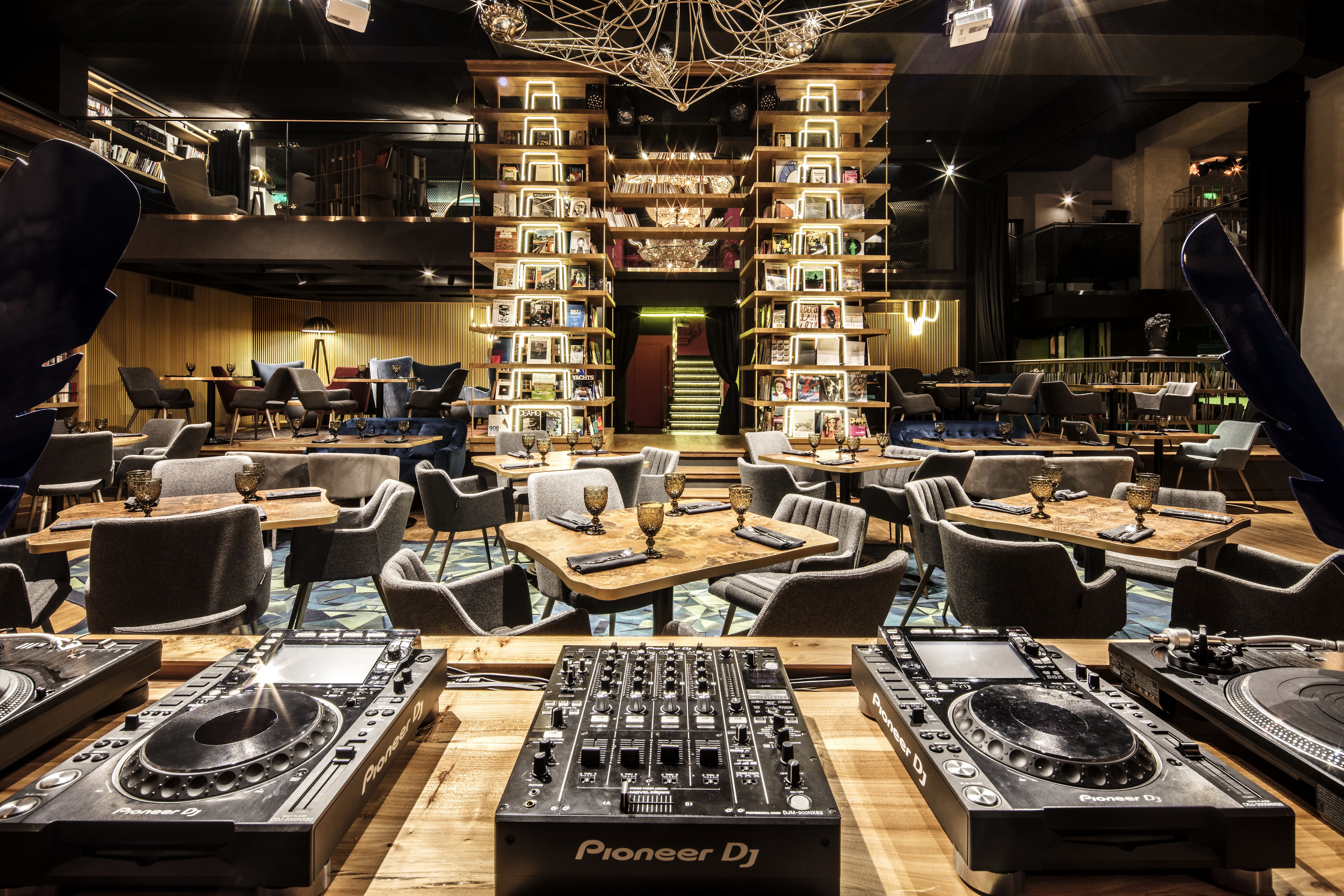
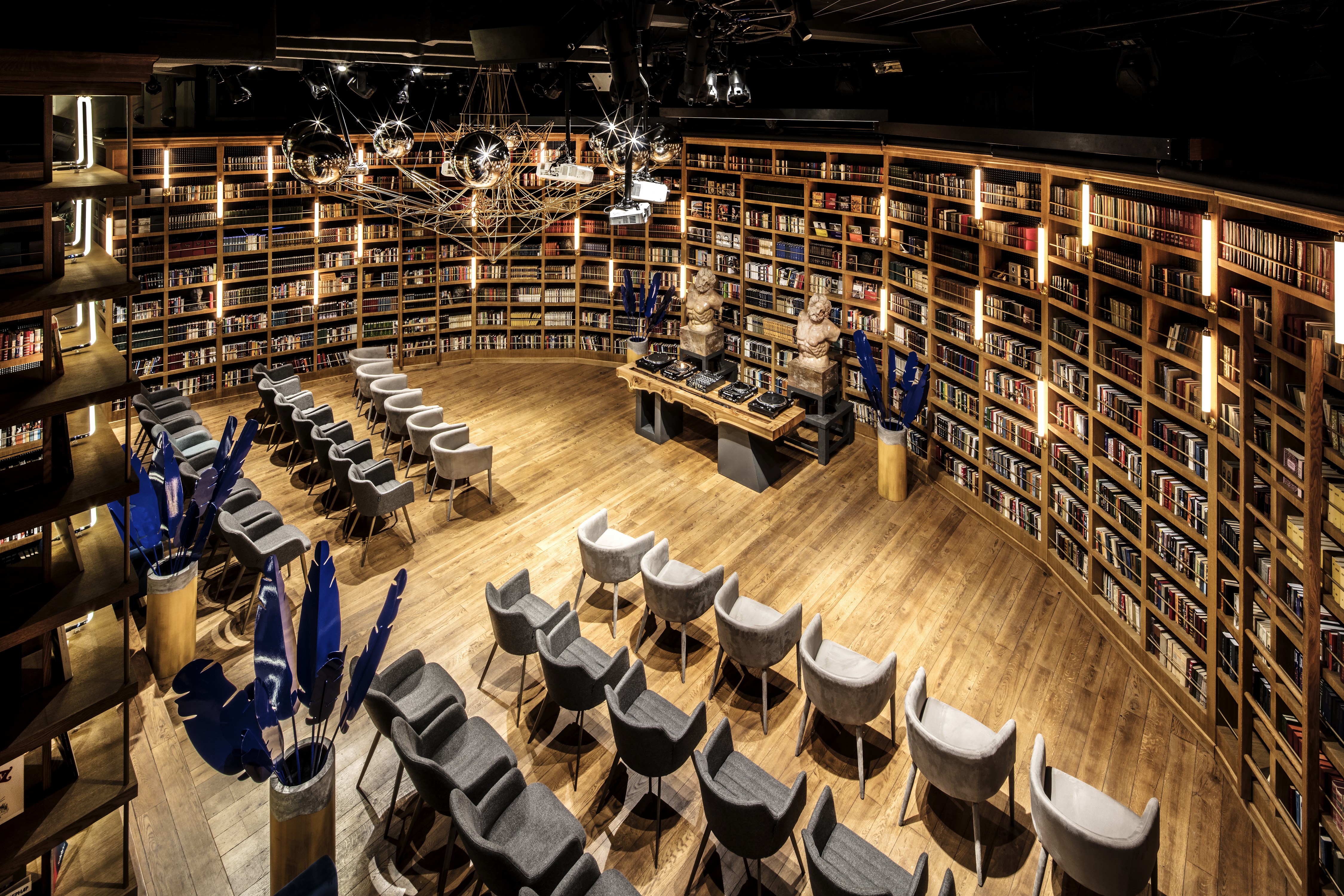
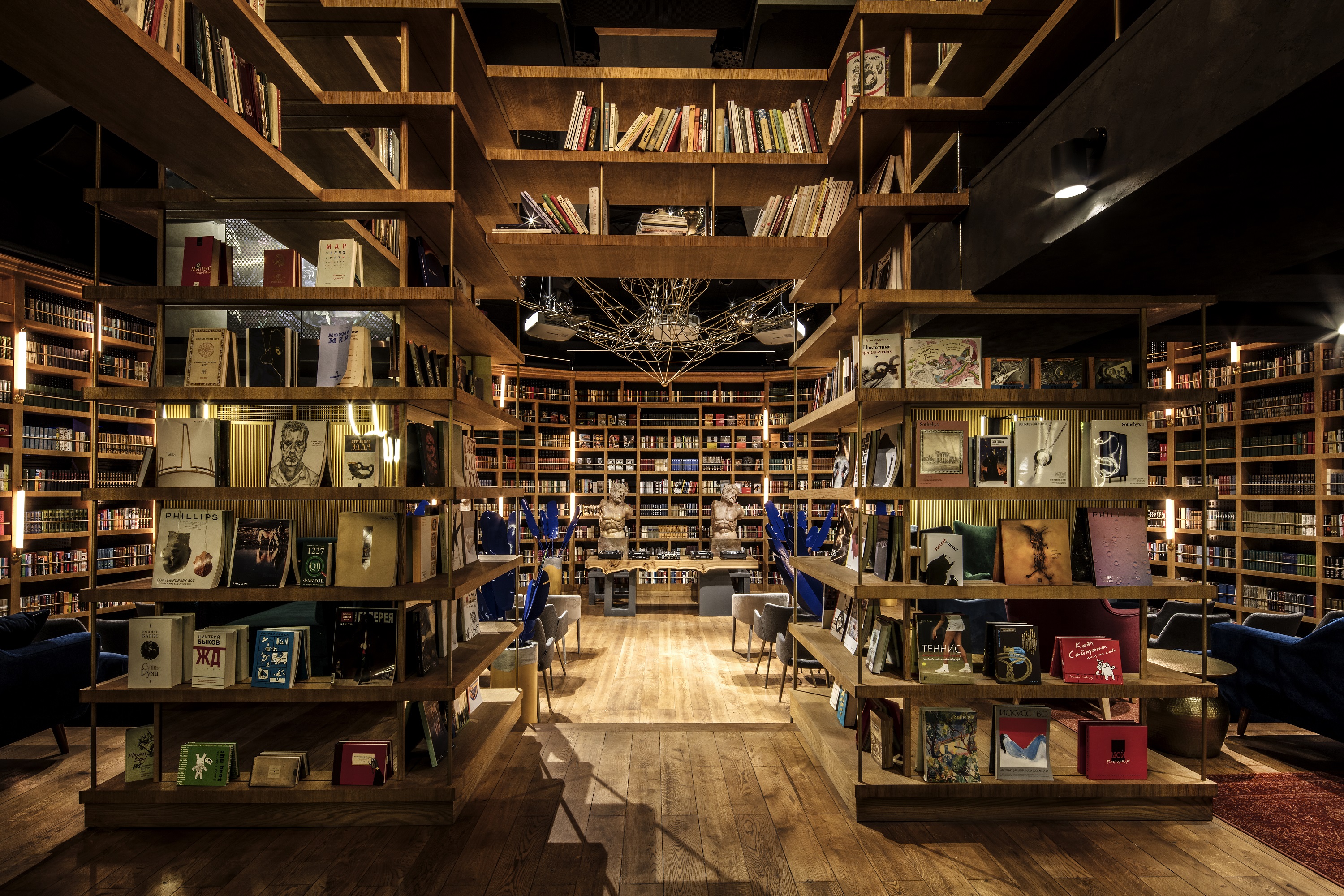
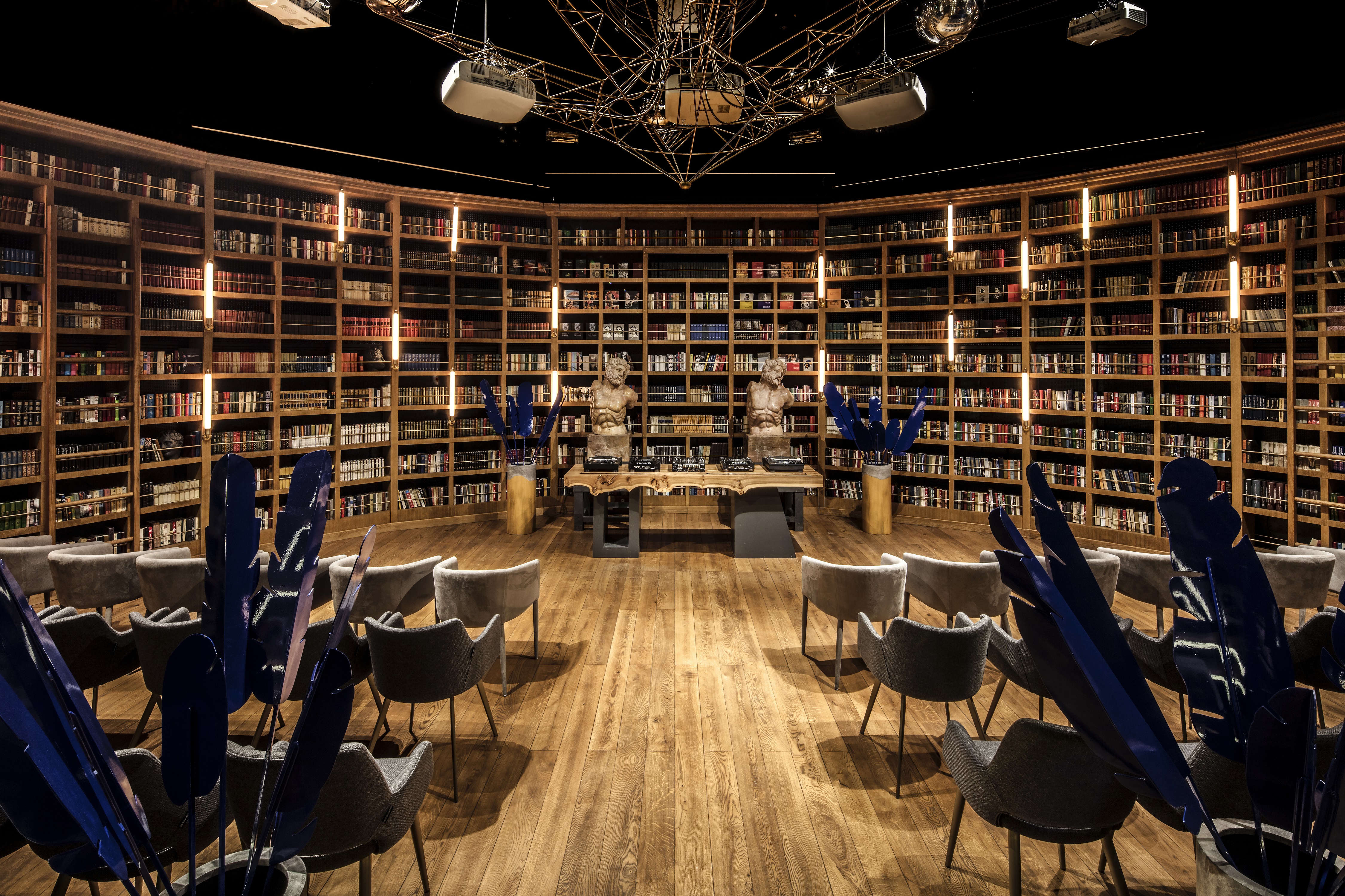
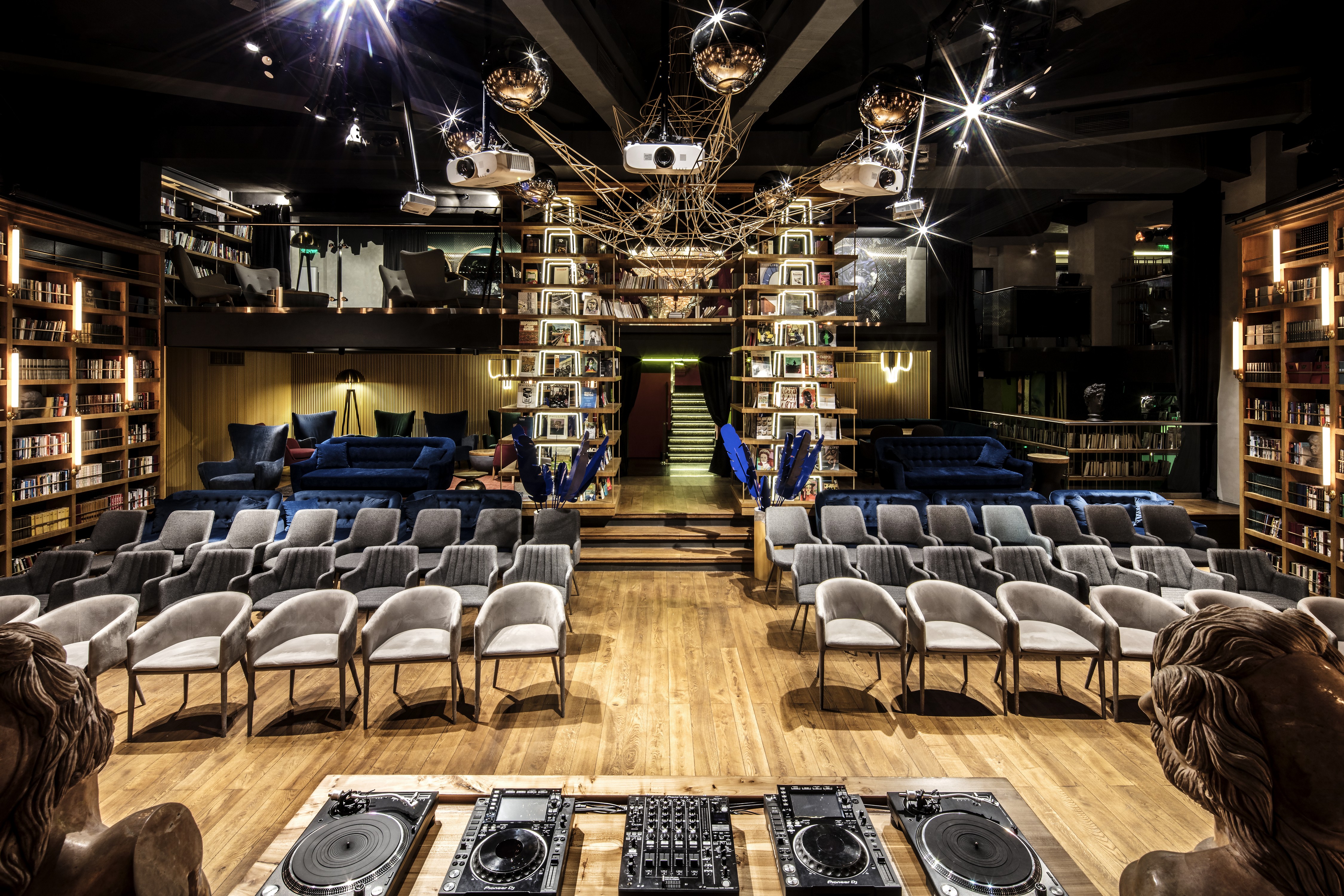
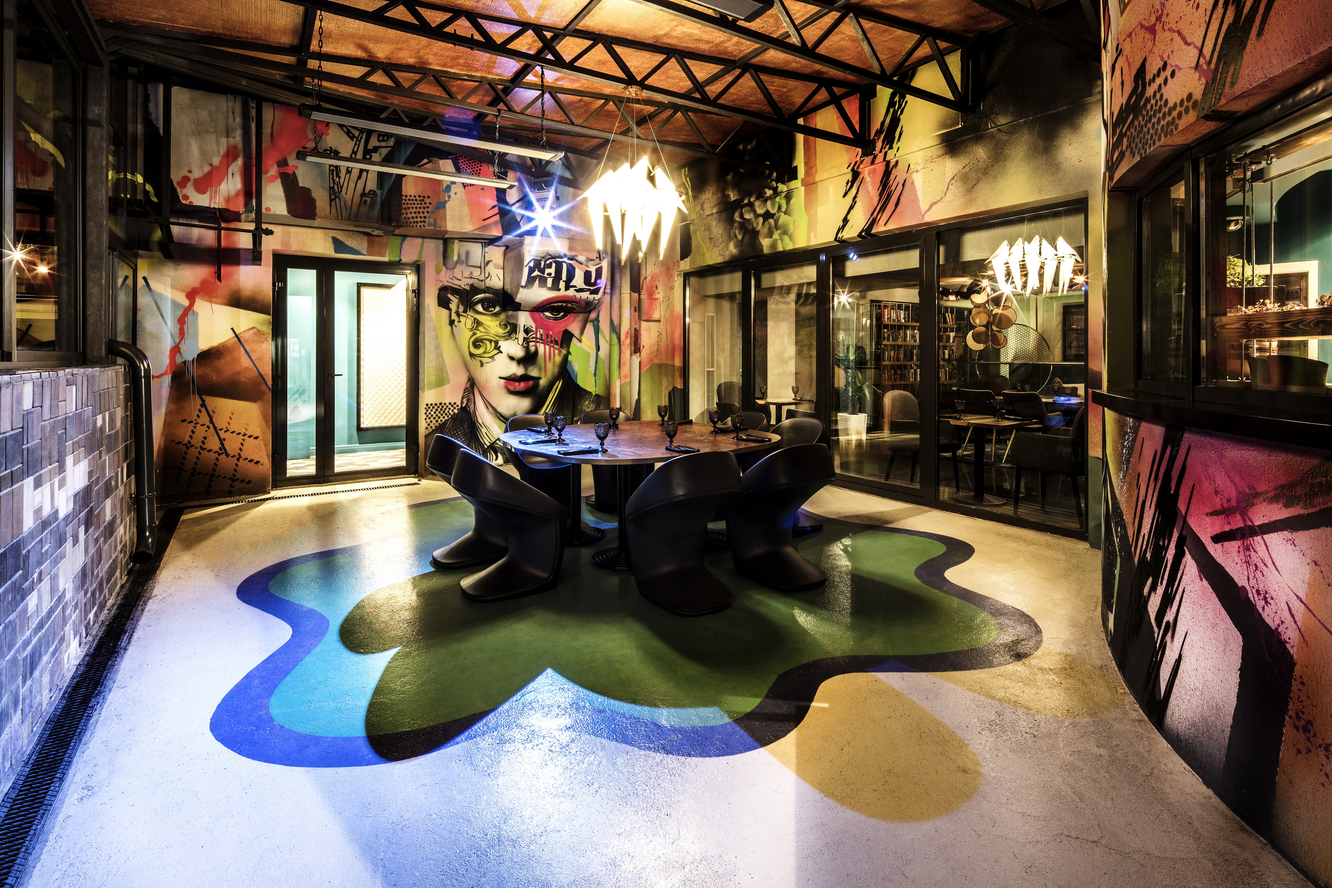
Right after entering, the guests see the theater zone; bright colors and unusual surfaces and finishes are intended to emphasize the modern repertoire. We have combined the theater with a classic library. The elements of the library’s design also appear in other zones. The decision to bring the library and the theater together is not only stylistically justified, but also convenient: during workdays, the facility will function as a restaurant and a library, and on weekends – as a theater and a lecture hall. A two-meter crystal chandelier sparkles in the library zone; we have decided to keep it from the previous space, and to play on it by hiding it among the shelves.
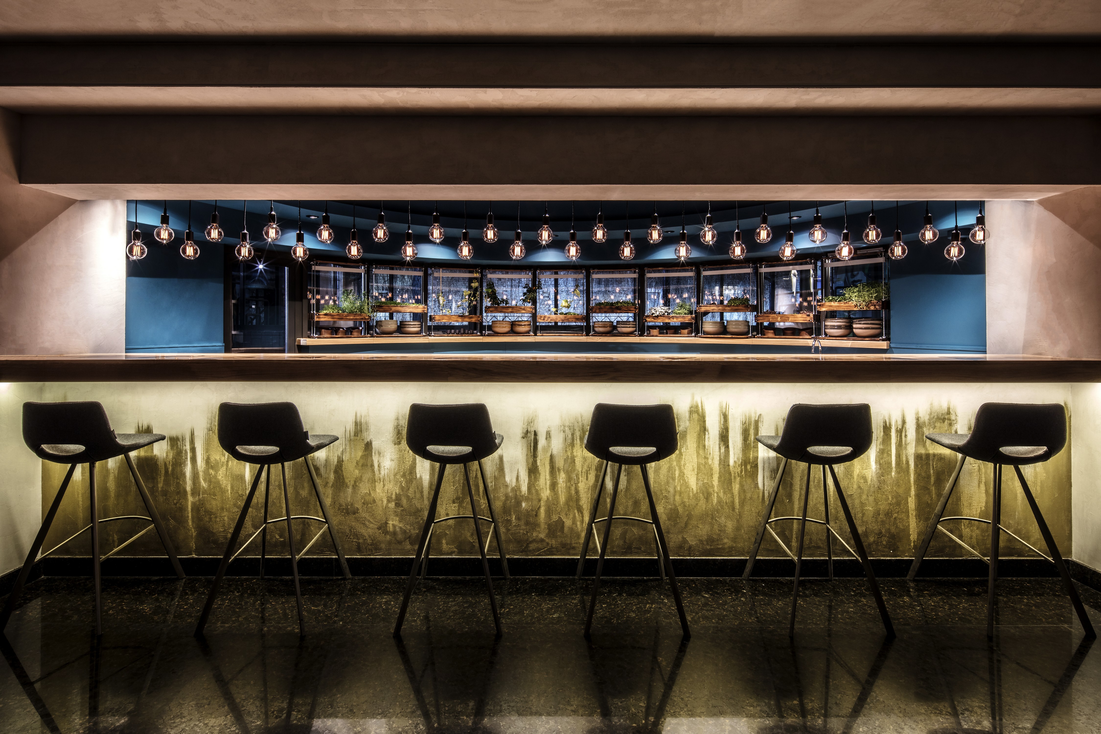
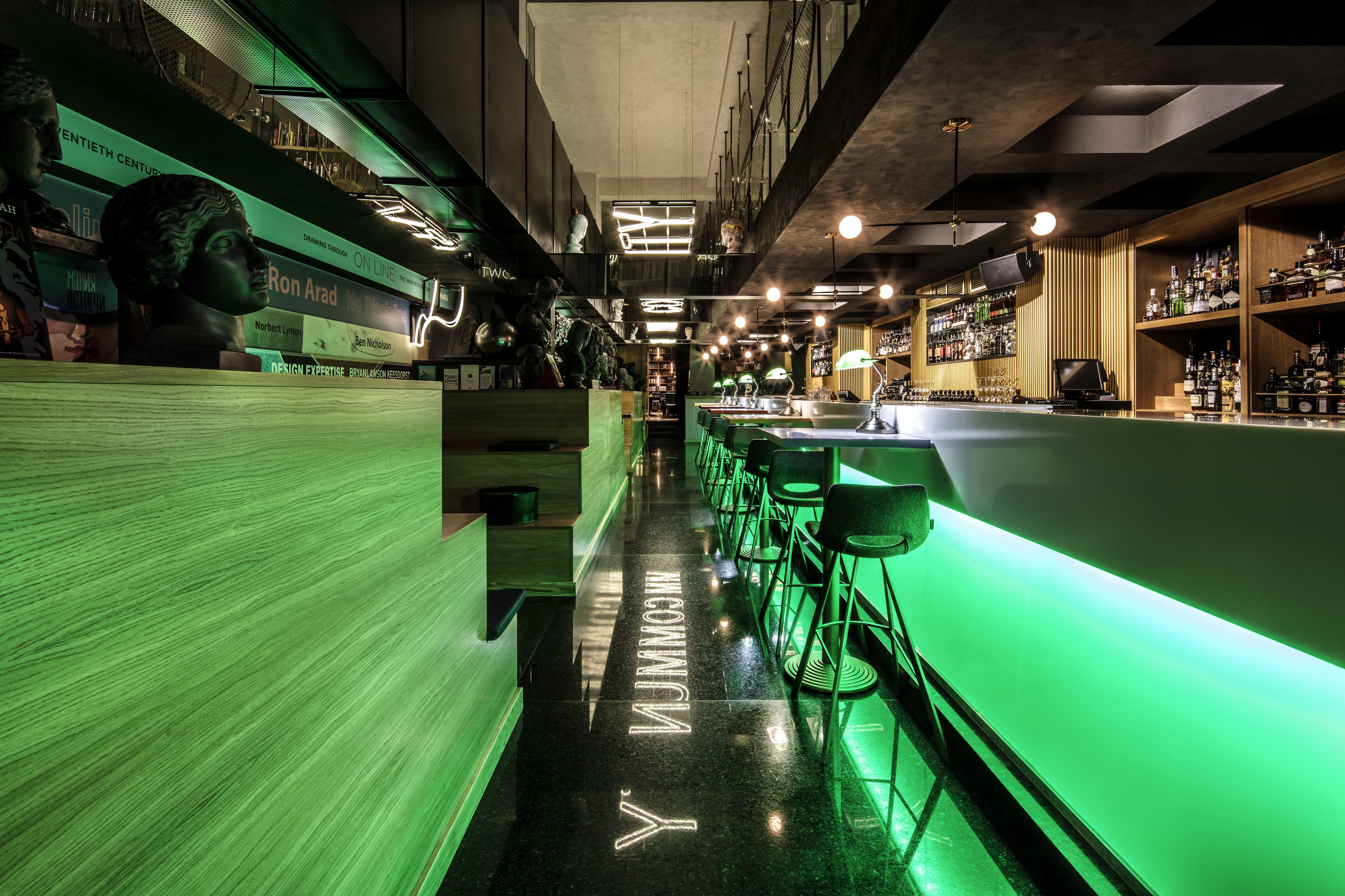
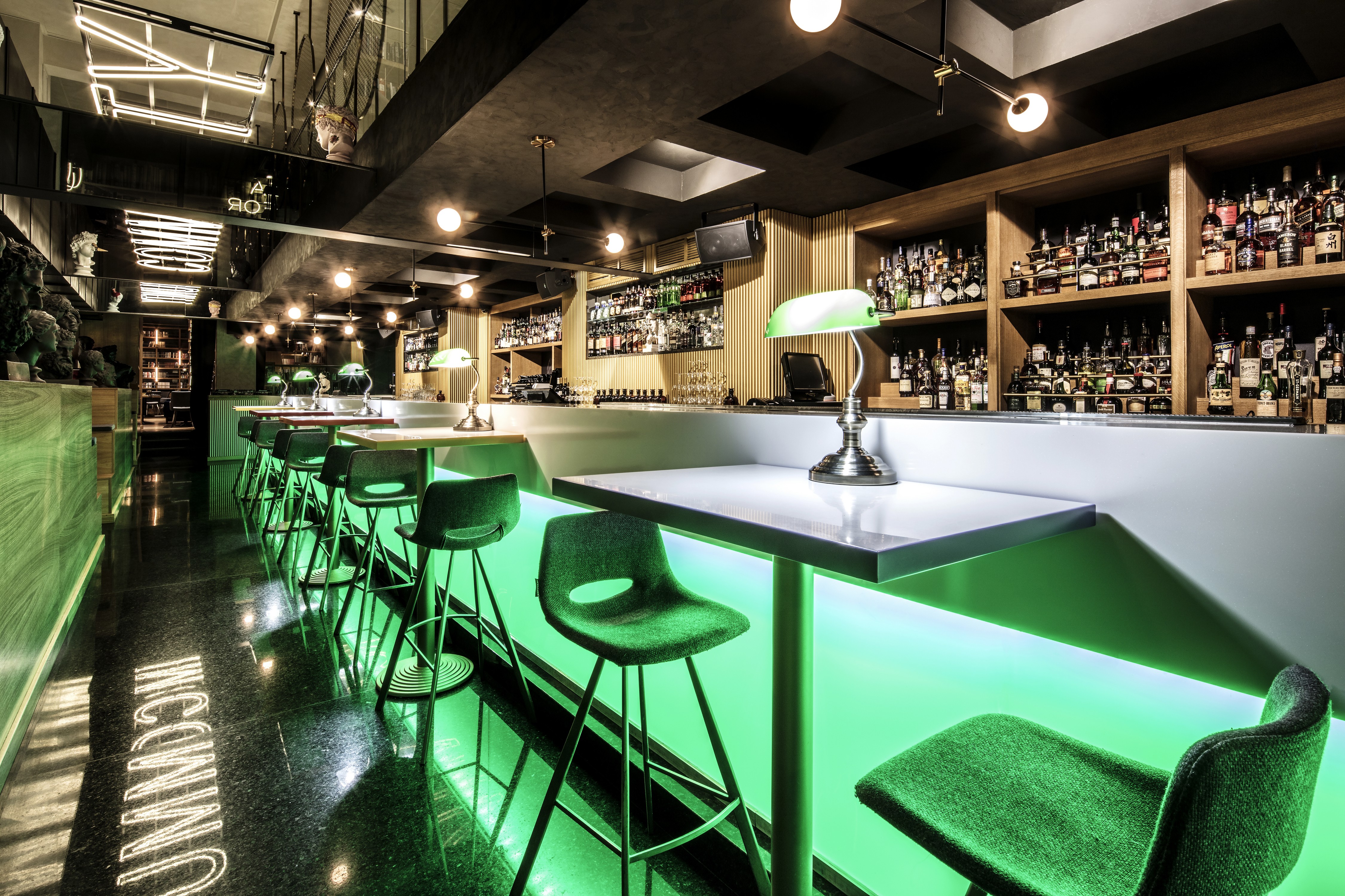
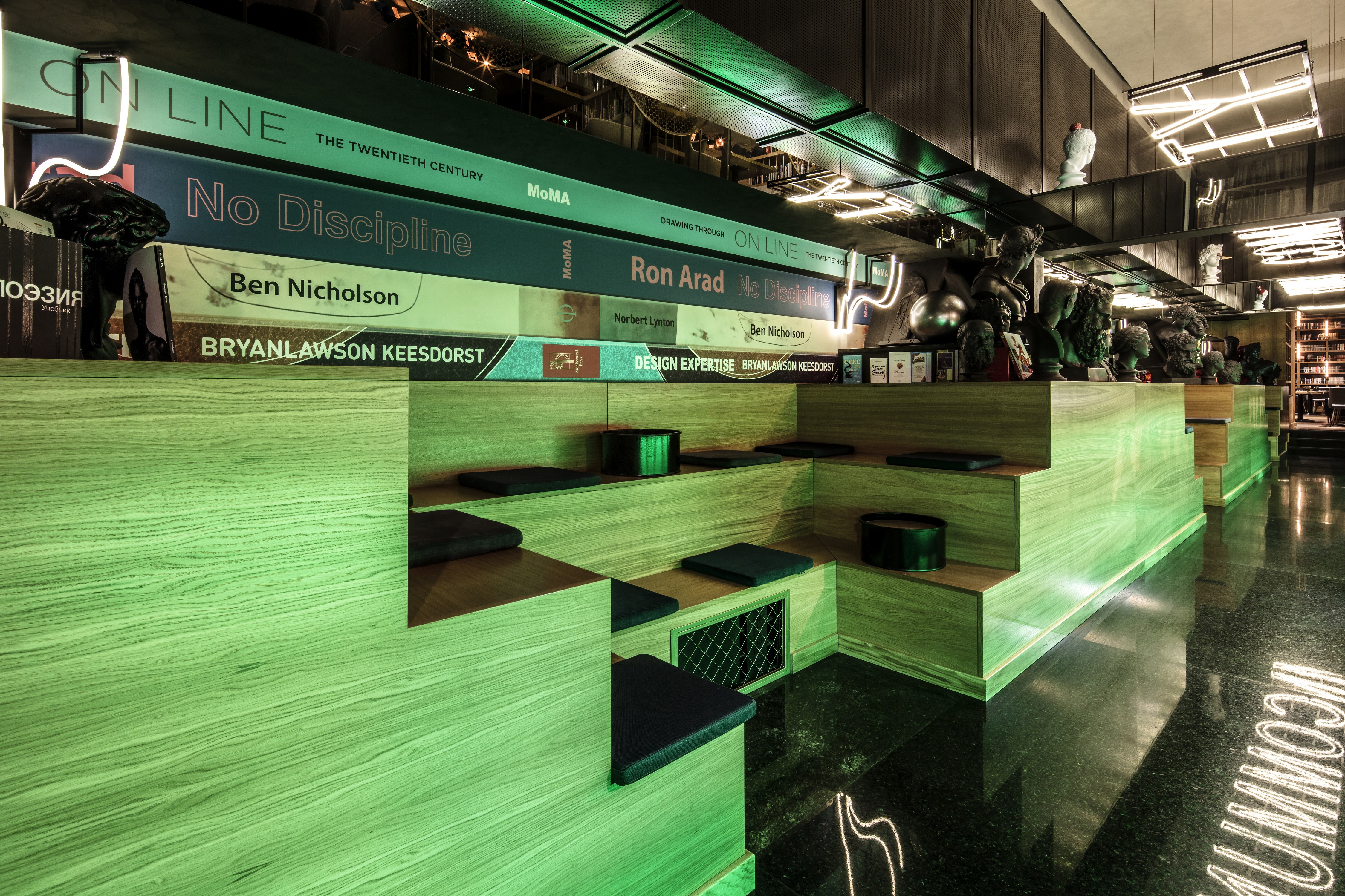
As the guests leave the theater and library zone, they enter the bar area. In order to combine them, we added some graphic images of books and benches that look like leveled lecture hall seating. The restaurant in Community is a separate zone. Even though it includes element of the theater’s interior, it is a bright and cozy space with accents in the form of library-style light fixtures.
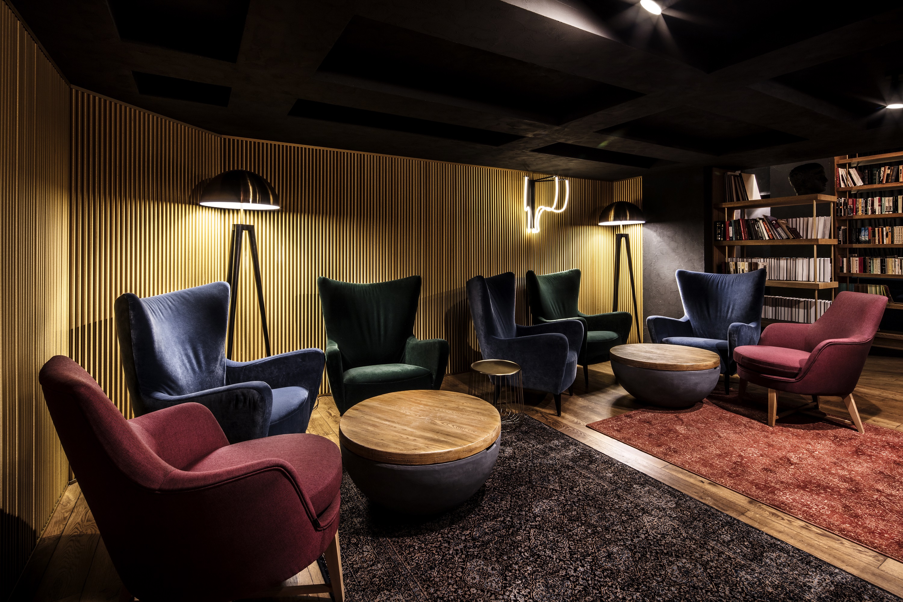
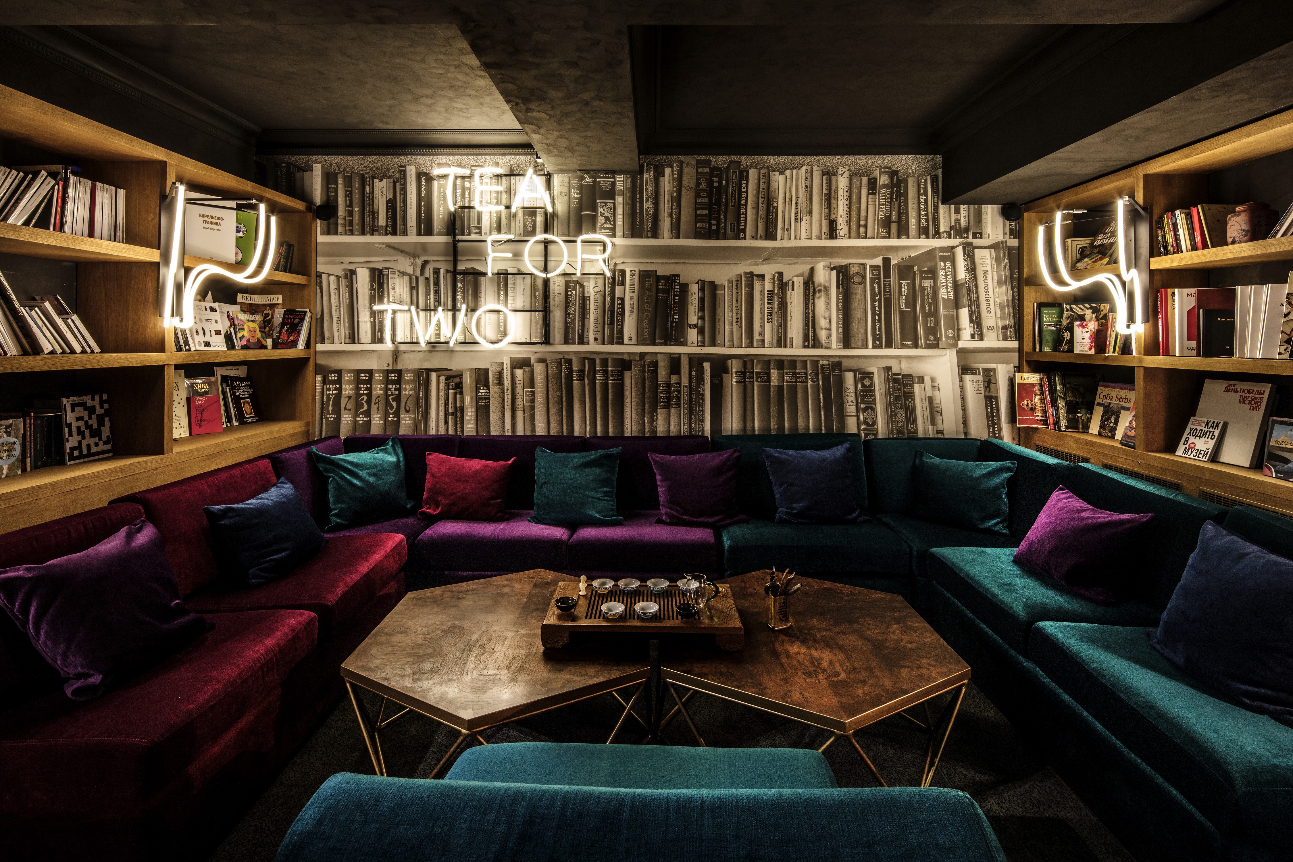
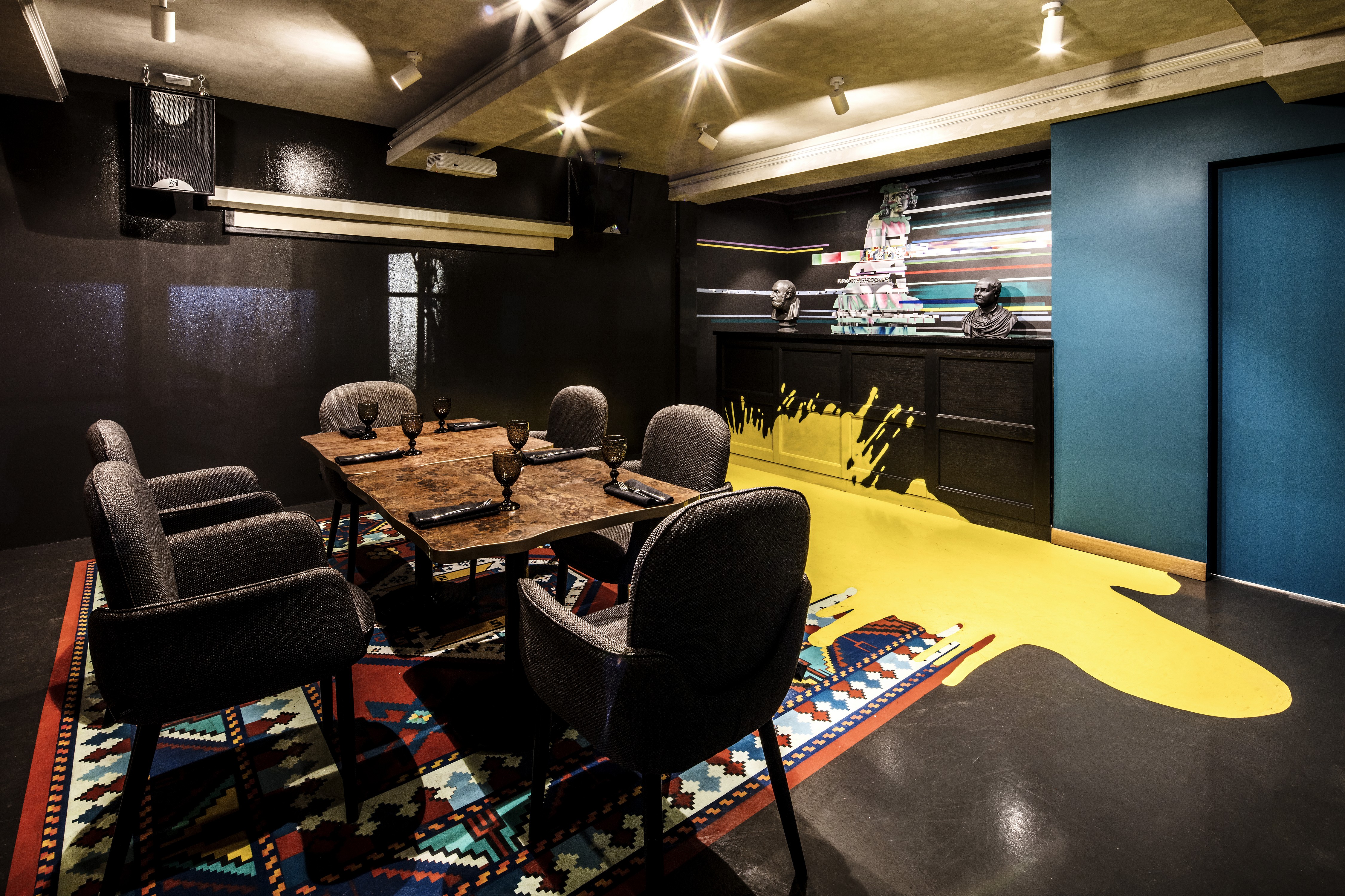
The Tea for Two tea room is also an independent space. The connection with neighboring zones is created through panoramic windows looking out at the restaurant and the bar. We carried on the library theme here by using soft and subtle lighting, and we placed a large colorful sofa for long tea parties and conversations. The room for master classes has a chalkboard covering a whole wall, as well as a library print and a rug print for increased coziness.
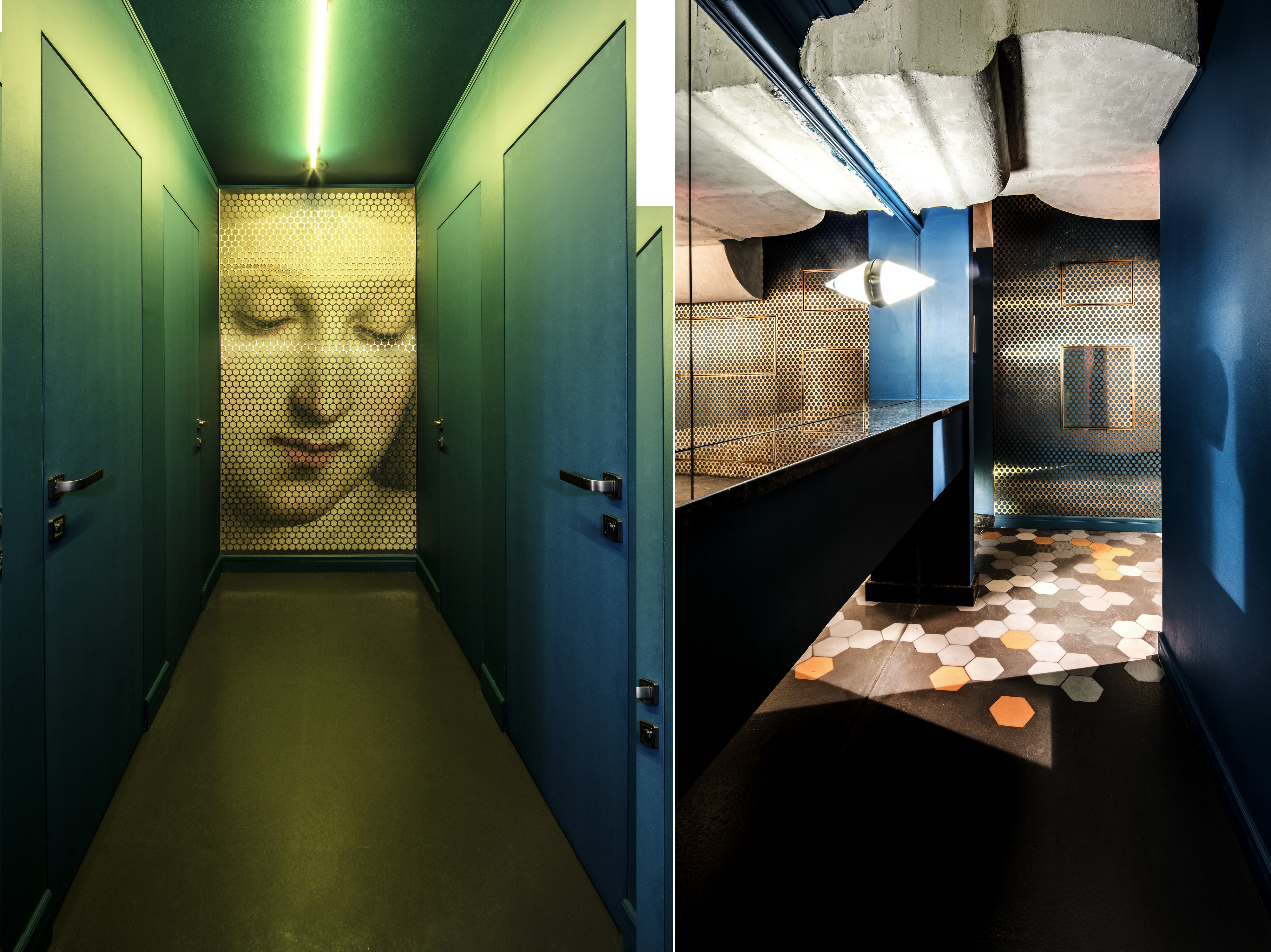
We use abrupt switches from one material to another throughout the interior to give it a picturesque and dynamic feel.
