Renovating Hotels to Drive Profits
Renovation is not only about beautiful design or only refurbishment. A “wow, it looks great” comment is not working anymore, neither will it help a hotel gain better ratings. Renovation is about getting a hotel more in line with ever-changing world and guests’ lifestyle, and if done this way it makes the hotel offer much more valuable. In 2016 we were invited to renovate public areas of Pullman Berlin Schweizerhof Hotel built in 1998. Now, when the renovated hotel has already been welcoming guests for a year, we can have a look at how the new design has impacted hotel performance. This case study shows how a renovation of a hotel’s public space helped to improve guests experience and to drive profits.
Task
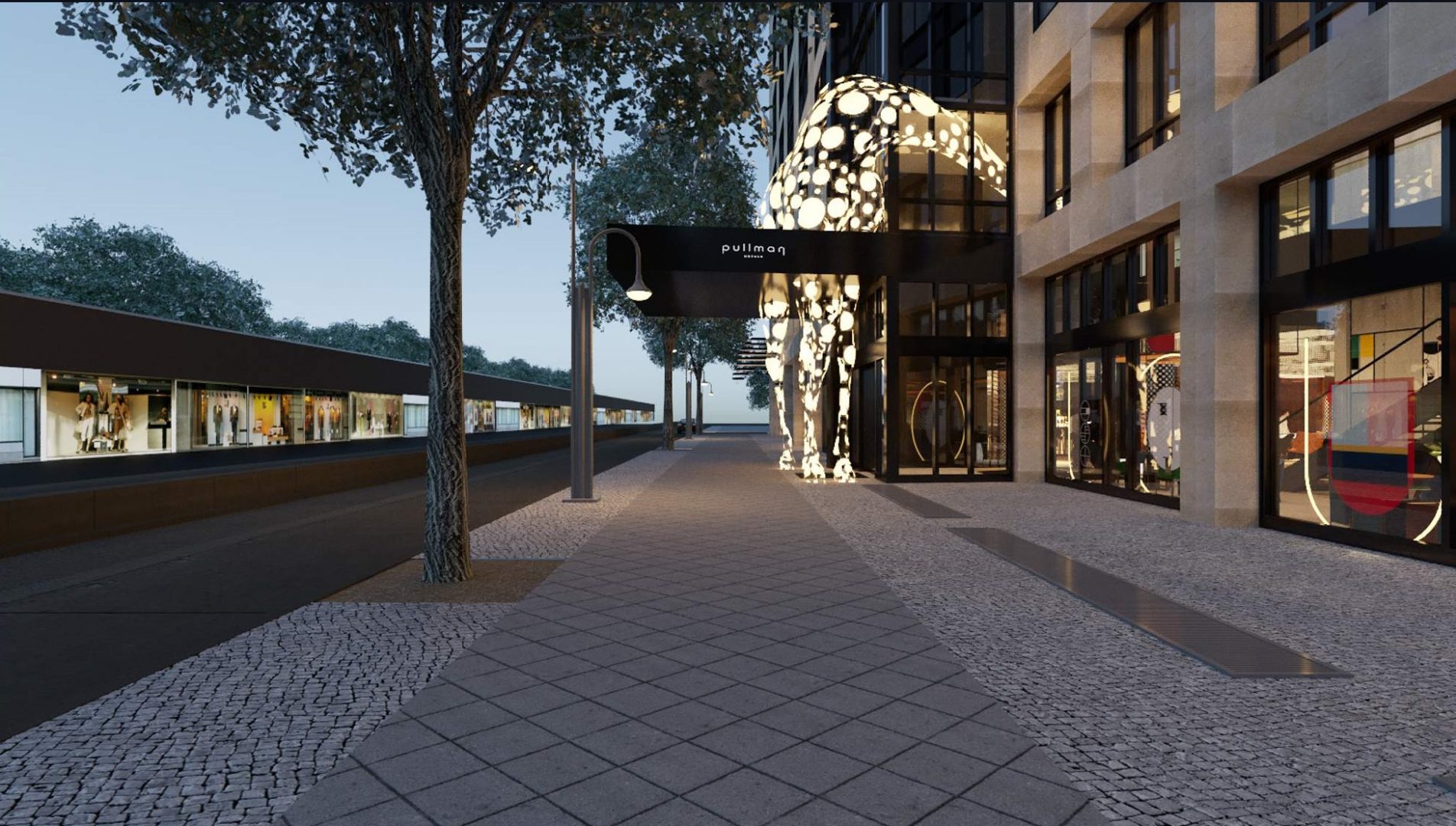
We were tasked with the renovation of Pullman Berlin Schweizerhof public spaces. The hotel was built in 1998 right opposite Berlin’s zoological garden. Initially being a business oriented district, recently the area has become a popular spot for young people thanks to numerous parks, shops and design hotels.
Challenges
The hotel stayed in operation during the renovation, that was completed in 6 stages – one zone at a time. We had to keep in mind the existing utilities and finishes, at the same time totally rethinking the interior design and layout. It is not easy to invent something truly distinctive in such a vibrant and creative city as Berlin. However, the artistic location only worked for the sake of the concept.
Idea
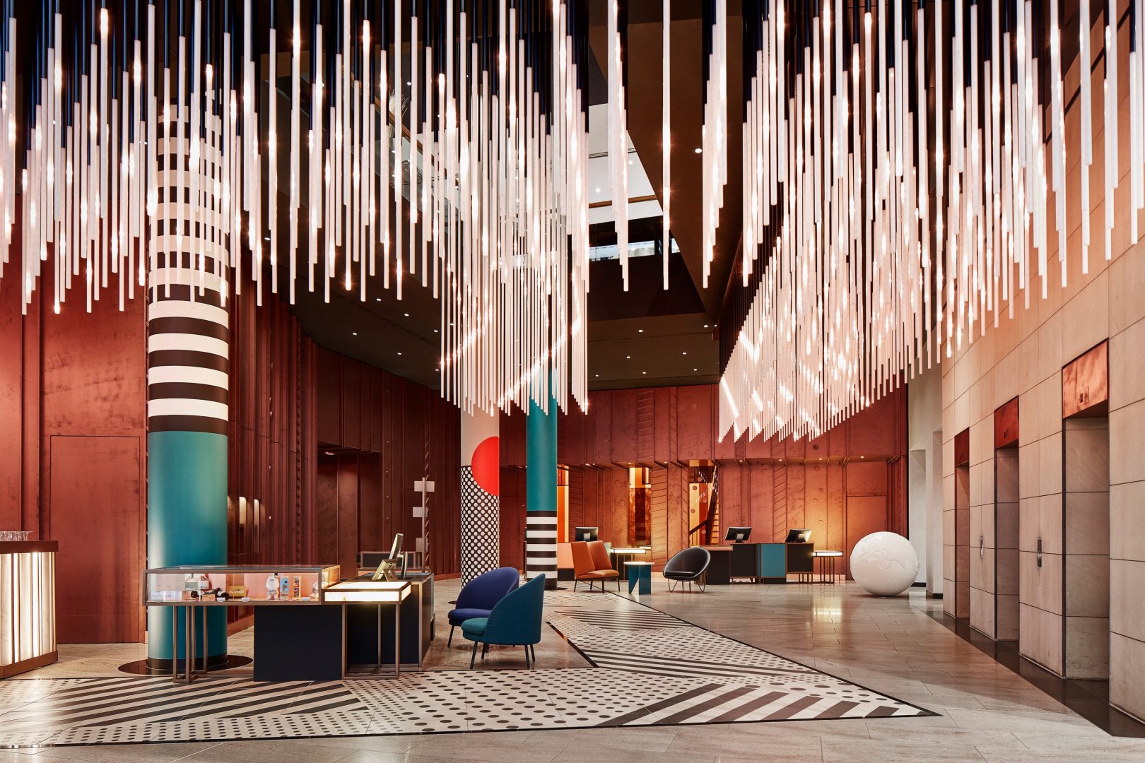
Following the approach, which was for the hotel interior to form a part of the city space – we decided to bring the nearby point of interest, the zoo, into the hotel and to do so in the Bauhaus style, the main principle of which is: Less is more.
Solutions
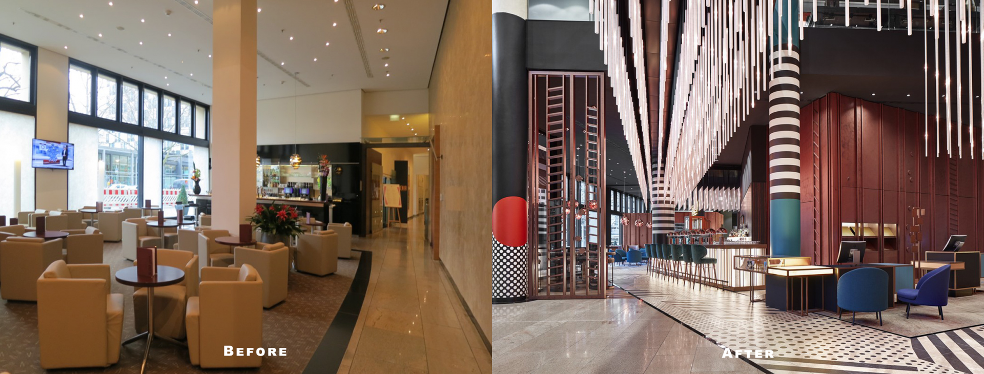
We have slightly and intelligently changed the layout. One look at the “Before” image is more than enough to understand why the hotel bar was deserted before the renovation. The idea to move it to the center of the lobby helped to attract not only the hotel guests, but also passers-by, and resulted in increase of the restaurant and bar profits.
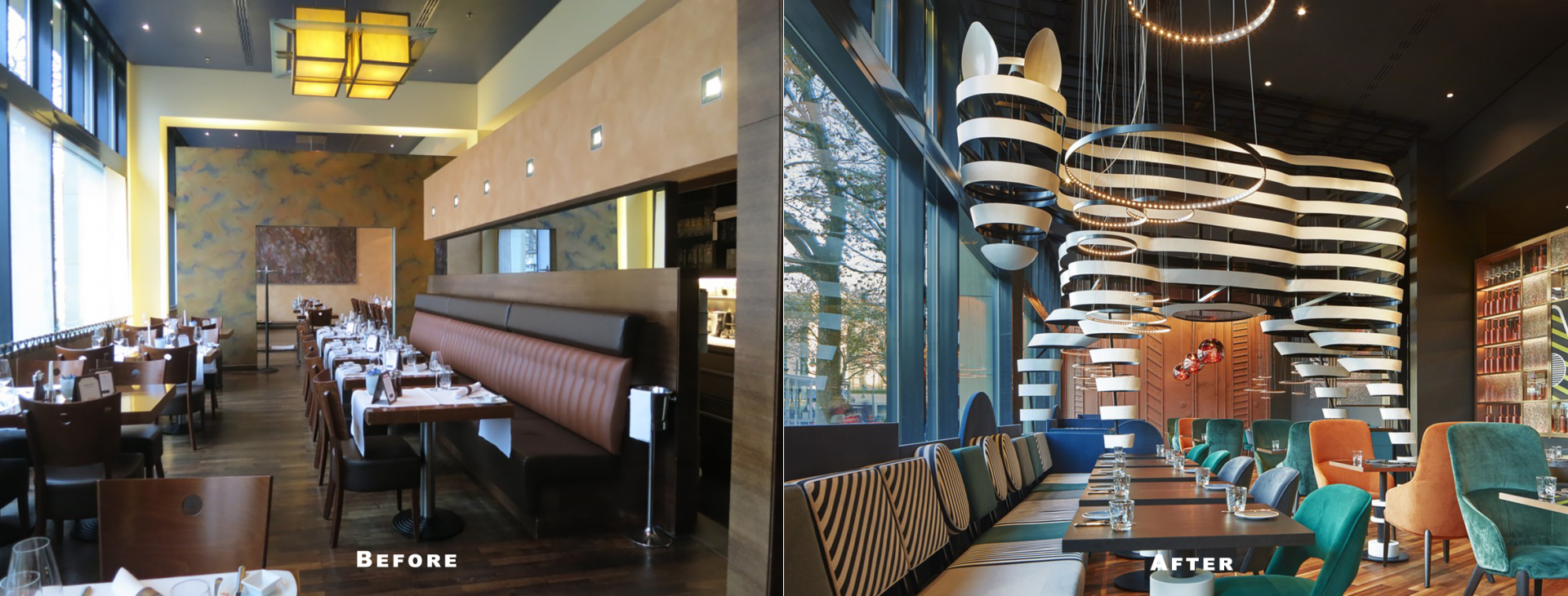
What can be done to increase guests’ flow to the restaurant? There are two tricks: first, we combined the bar and restaurant zones. Both are visible right from the entrance and from the lounge. Secondly, we created a wow-effect in the restaurant – an oversized zebra consisting of Bauhaus ornaments attracts attention and invites people to come in and eat. Thus, the restaurant works on its own as an independent venue, serving an audience wider than just hotel guests.
Reception desks were moved closer to the entrance in order to improve their functionality. Time has served as the best proof that such placement is a more convenient one for both guests and personnel. Another achievement is the new conference desks. Premium stationary desks are more appropriate to the business hotel image. However, we should not forget common sense – when there are no conferences in the hotel, guests use these desks as ordinary comfortable work desks.
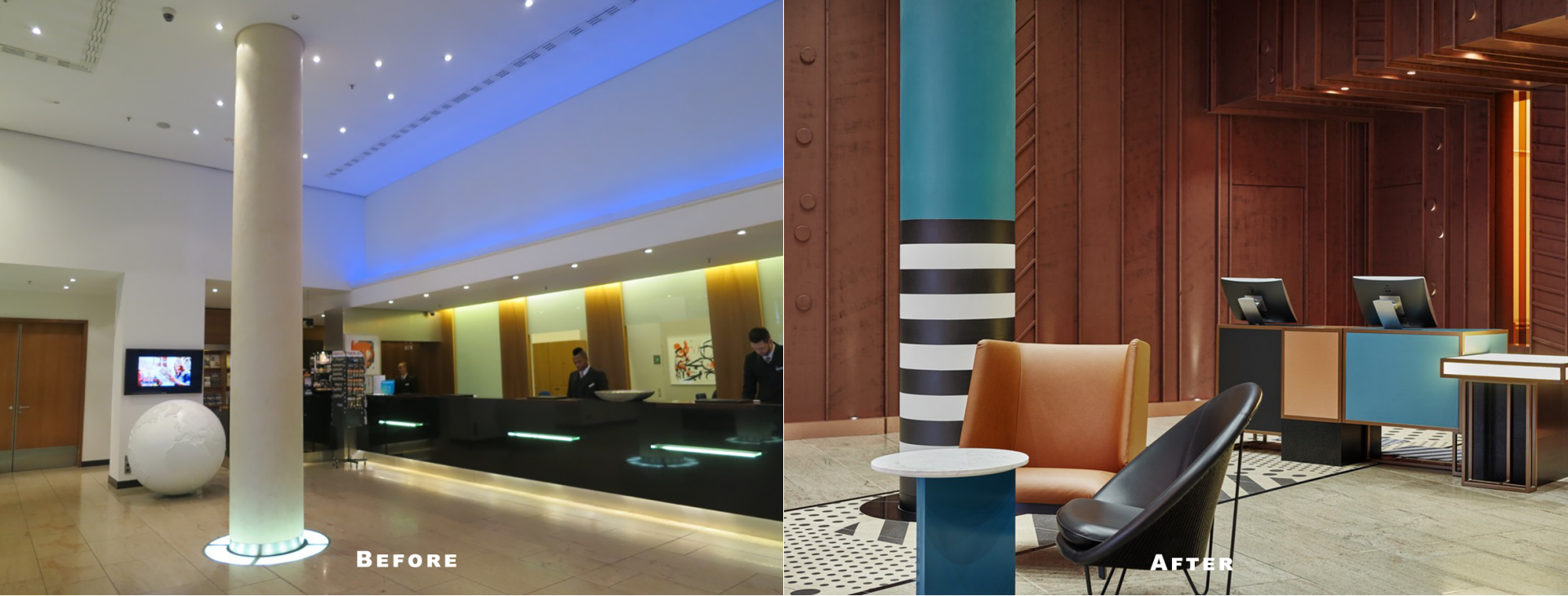
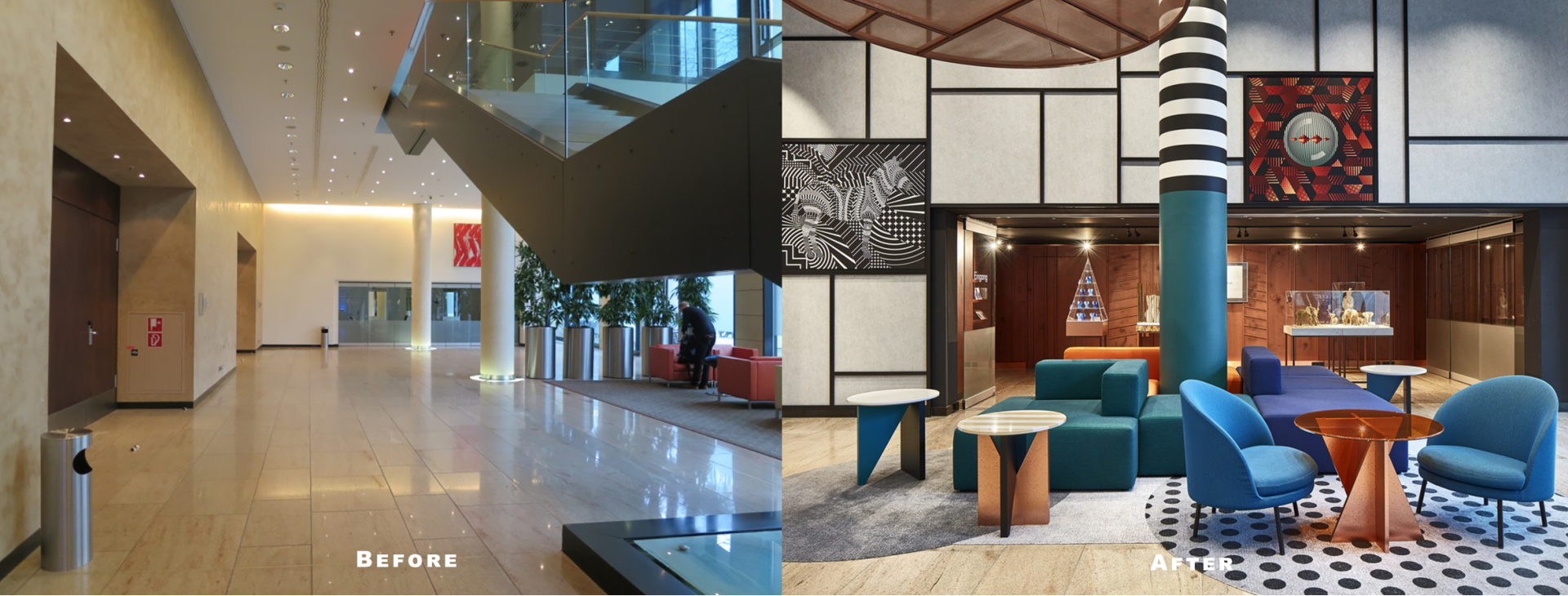
The ceiling also serves as an art object: a large 3d LED screen attracts attention from the outside, and creates a relaxed, warm atmosphere inside. Its most important feature is interactivity: usually it shows patterns in the general style of the hotel, but during special events or conferences, for example, it can be used as a space for advertisements. Using LED lighting here not only helps to drive down energy costs and consumption, but also allows to reduce maintenance and cooling costs as well.
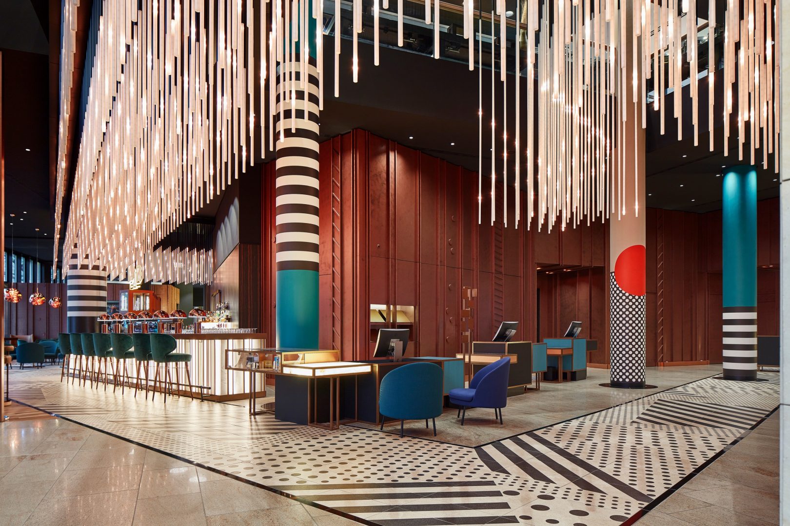
The new design has erased the borders between the interior and the outside making the hotel friendly both for guests and passers-by. Our ZOO themed objects and the use of German Bauhaus style elements are distinctive and fit the place so perfectly that the hotel design will stay relevant even after 10 years.
More photos of the project here