REMY KITCHEN BAKERY
Opening date: 2018
Area: 165 m2
TASK
To create a simple, restrained, yet simultaneously warm and comfortable venue – where guests can make themselves at home.
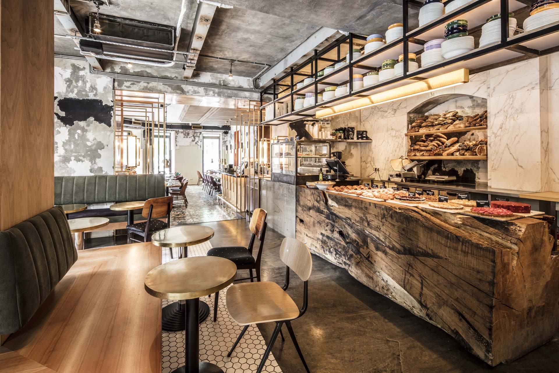
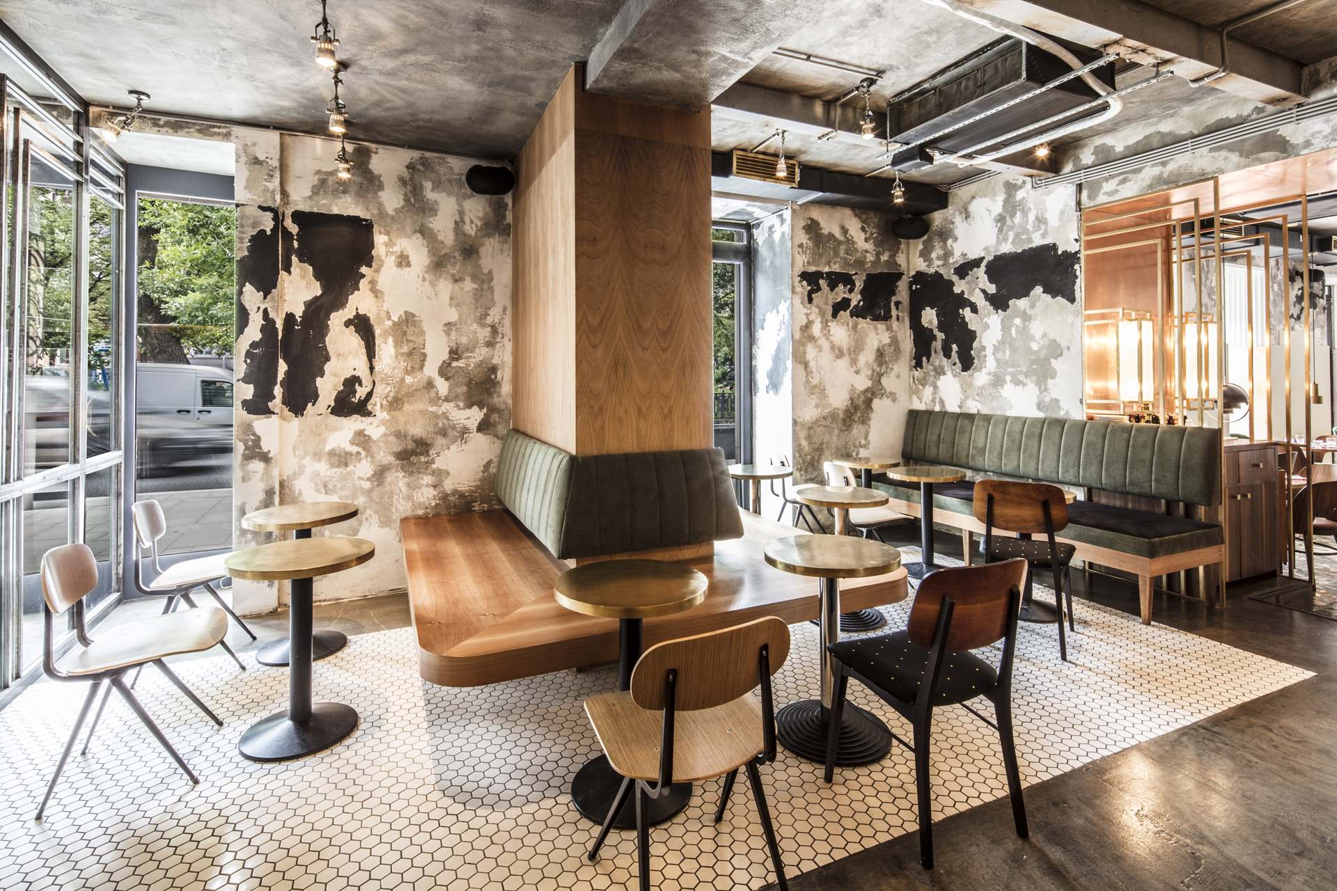
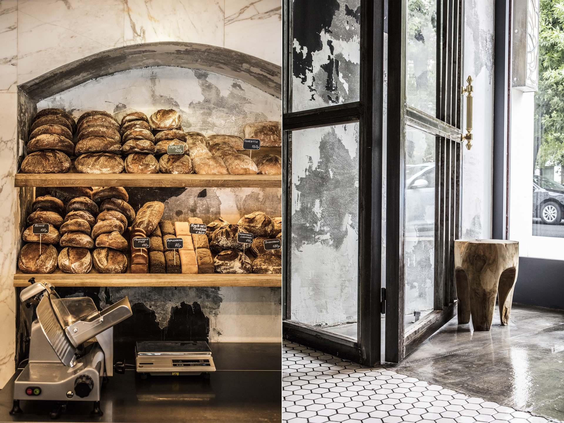
The premises are split into three areas – two restaurant halls, and a separate room offering a deli-bakery and coffee-room, where customers can quickly and cheaply purchase bakery items and snacks. We had to divide up the premises, as well as unite them.
CHALLENGES
The difficult task was to bring together three halls that differ sharply according to their functionality, time, and atmosphere. We had to create an individual and comfortable atmosphere for each of the zones while being careful not to split up the venue up into three stylistically separate spaces.
IDEA
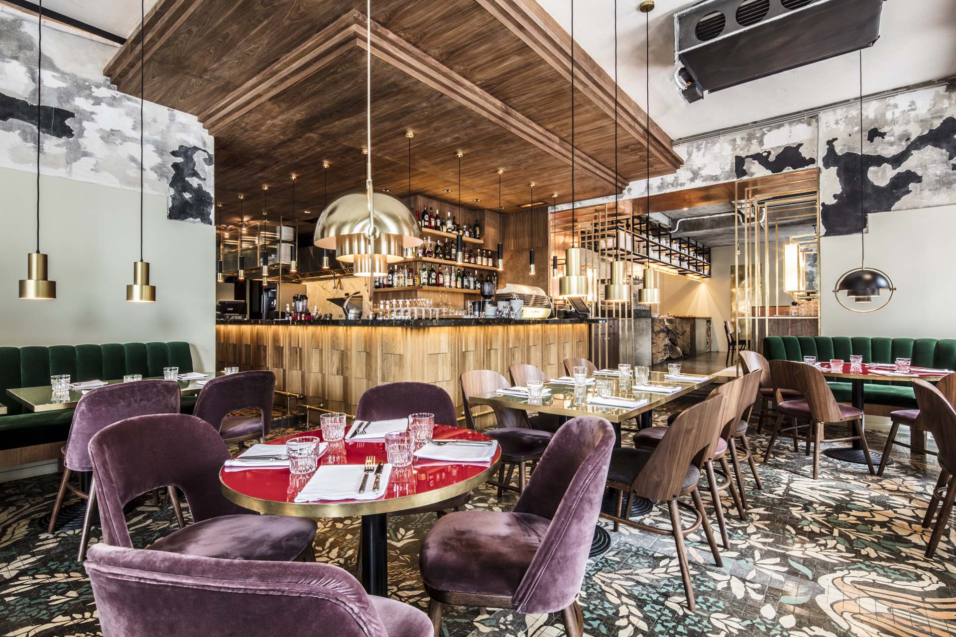
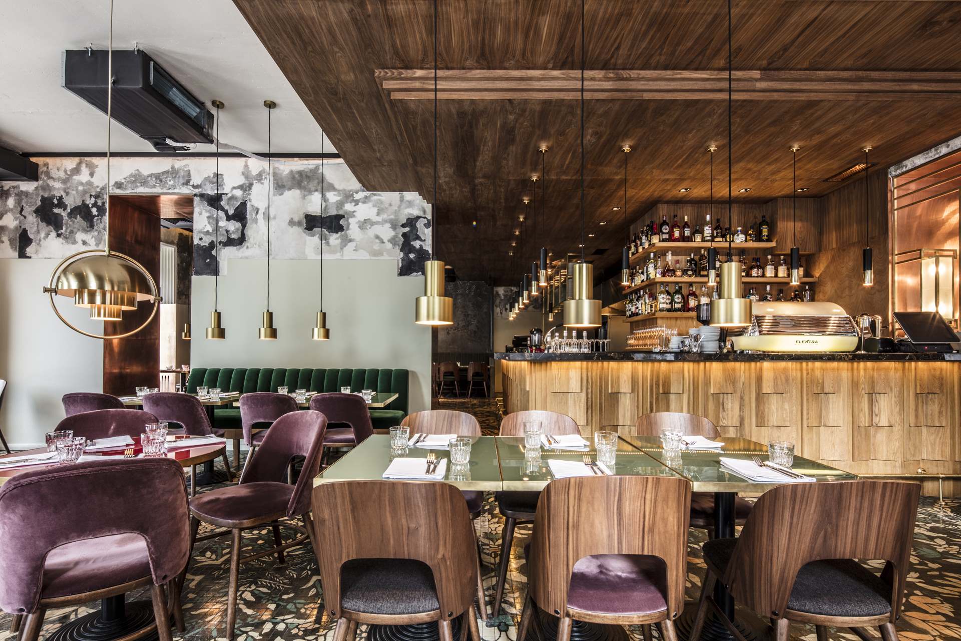
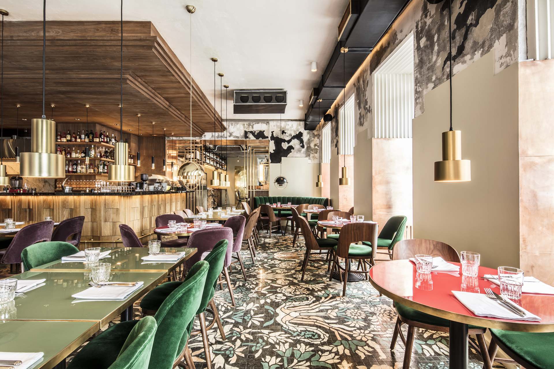
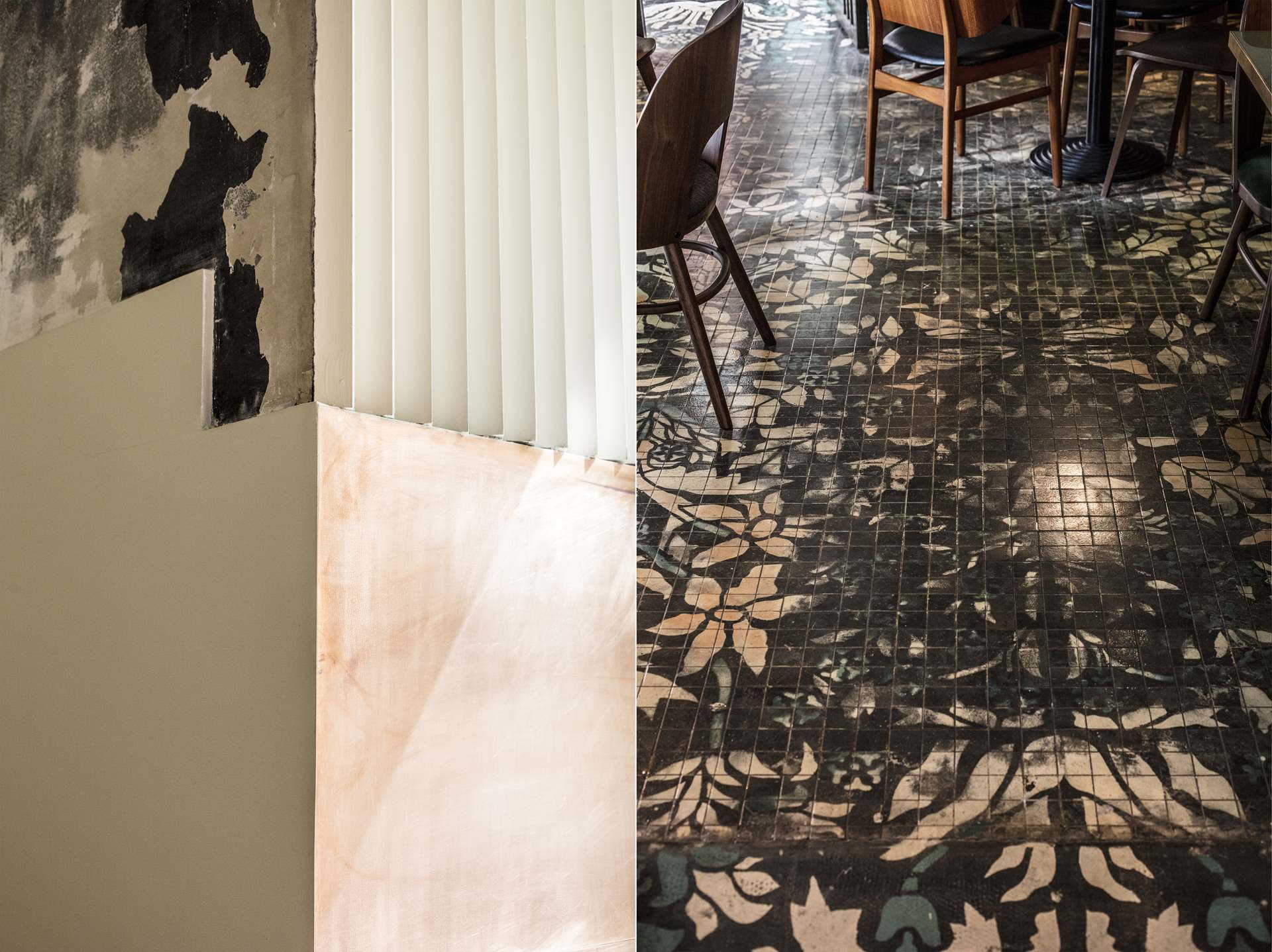
We produced a venue that’s on the cusp of the past and the future. Granny’s pictures on the floor, yet with a hipster-finish ceiling – so there we’ve got the past, along with a bar of Art-Dèco elegance, and graphic-design windows to show a new wave of great style returning.
SOLUTION
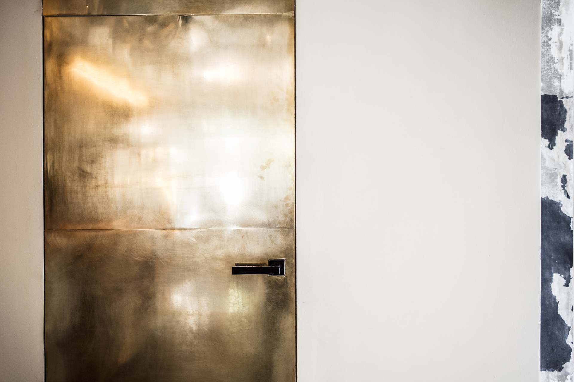
We brought the different spaces together by using a design decision – a smooth transition in the finishing materials of each zone with the next one – the finishings of the windows and walls, floor, metal, wall-decoration, marble, and veneer. By utilising different finishes we succeeded in separating one space that consists of the ready-to-eat food sections, bar counter, and the open kitchen, – with the use of different furniture and lighting.
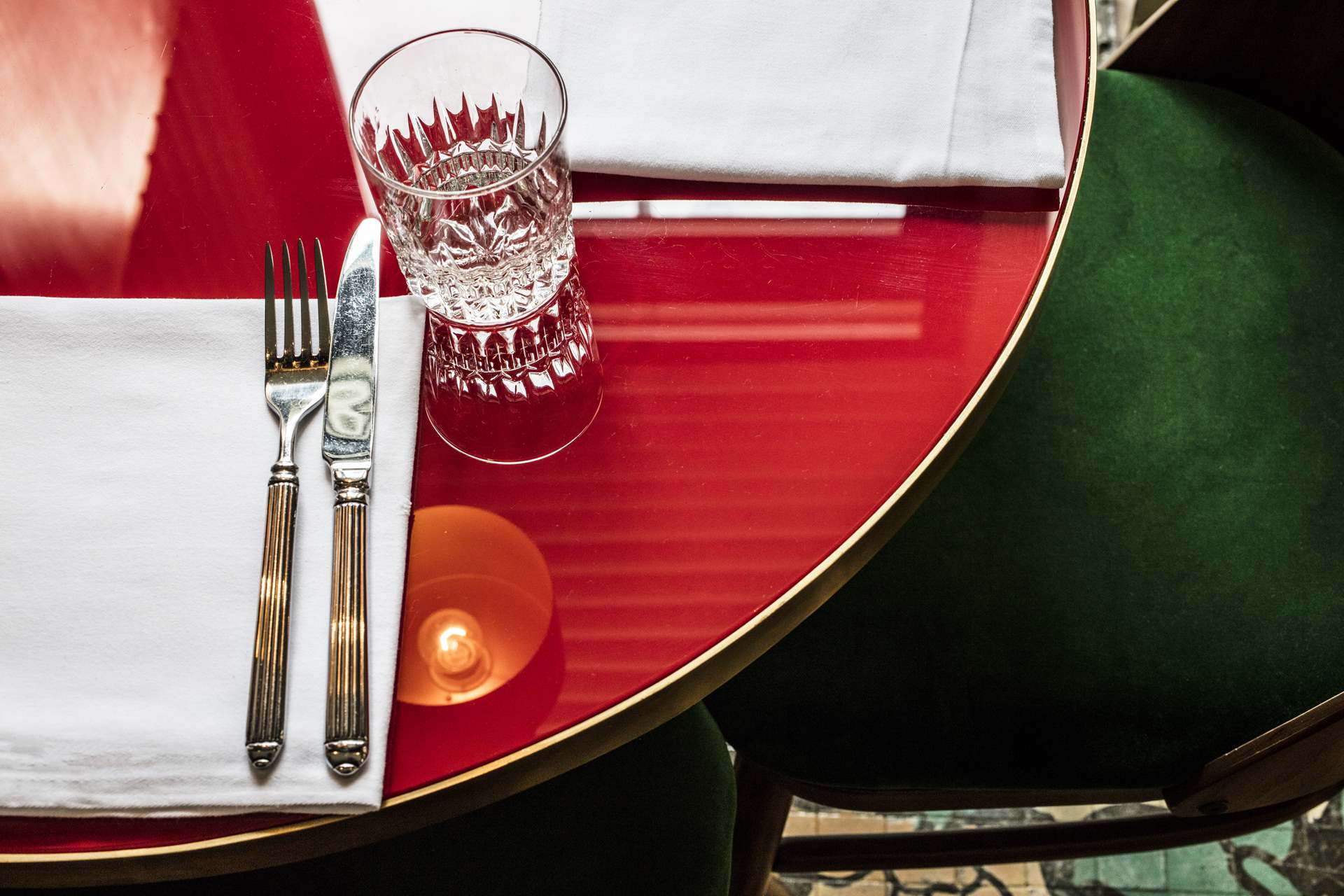
The ready-to-eat food hall of the building has a wood-burning stove and a contact table, which add to the warm, light and comfortable atmosphere. The second hall, with its bar, had to be extremely elegant yet restrained, to show a mix of old and new, the period-look bar lit with contemporary lighting. It’s a room dominated by the strict lines of minimalist furniture, with one wall of the room featuring hand-painted decorations. The picture which we see on the floor tiles was also drawn by hand – and it’s intended to age over time, as its image slowly wears. The third zone is the hall with an open kitchen. We were asked to enliven the dining experience for the guests, whilst leaving it technically intact.
The interior designs feature a wide range of different textures – wood, concrete, tiles, and fabrics. They all exist side-by-side as one living organism, reflecting an eclectic shabby-chic contemporary approach.
Photo: Nikita Kruchkov
