MGALLERY | Concept
Jurata, Poland
Design completed in 2018.
Did you know that…
Jurata is a place where the cold waters of the Baltic Sea meet the warm waters of the bay? The unique location of the picturesque sand bar inspired our design concept with its main theme – the unity of opposites. The Baltic Sea is symbolized by cold hues and hard edges, while the waters of the bay are embodied by warm colours and soft shapes.
Reflection in our Design
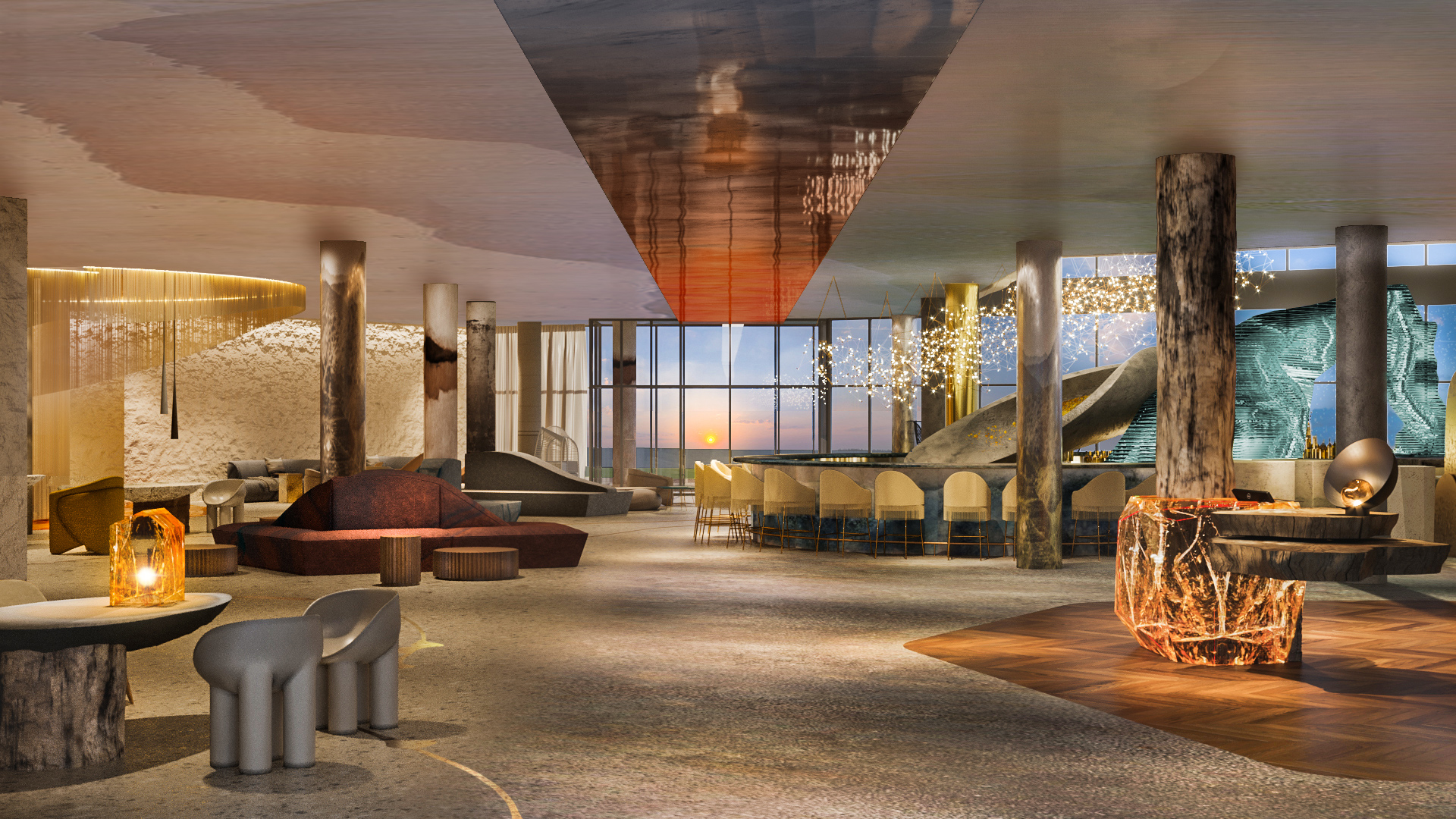
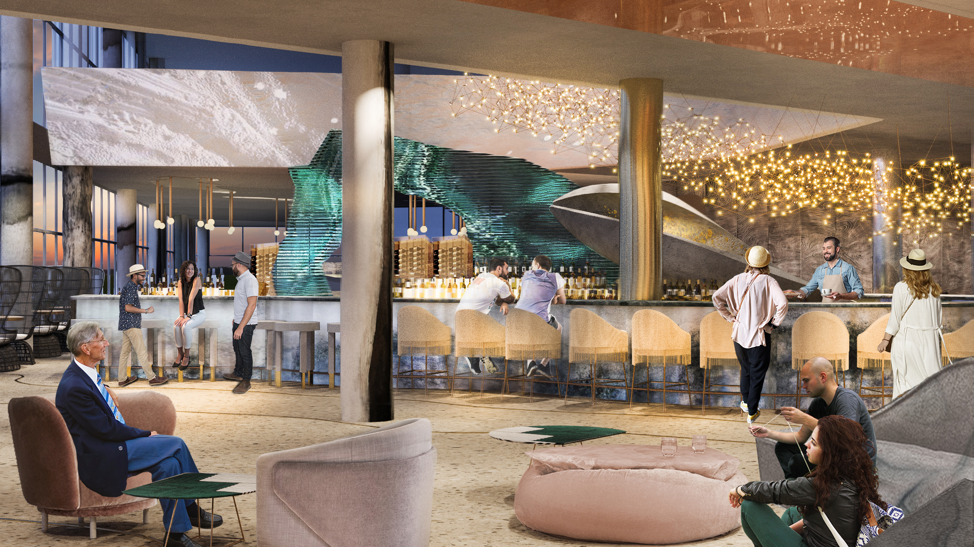
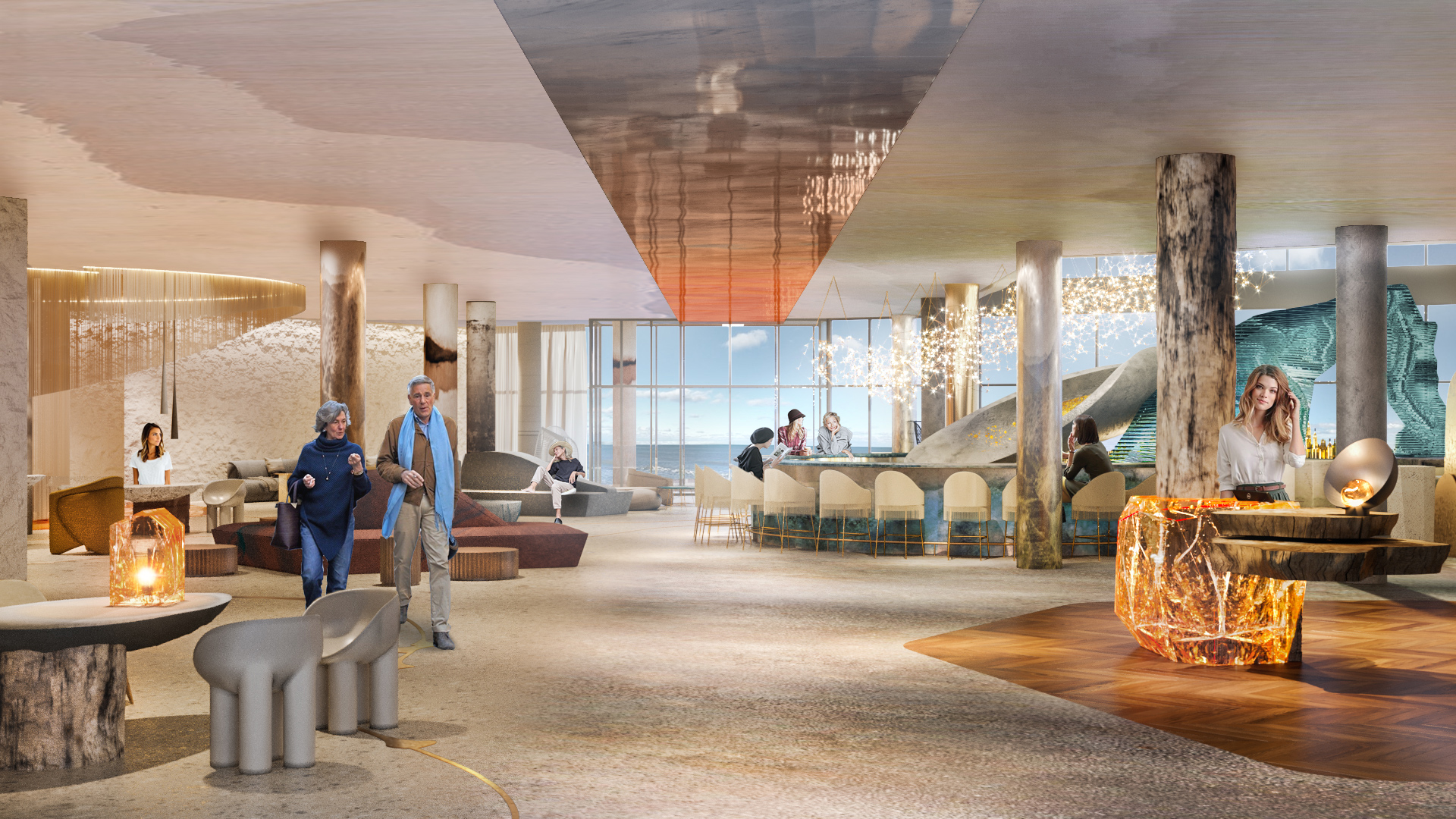
A special place in the lobby is dedicated to the bar, with its central part repeating the shape of the Jurata sand bar. It is also a part of the main axis of the space, and this is where the two main aspects of the concept meet and mix. The warm area is where the wavy contours and flowing lines prevail, while geometric lines are more actively pronounced in the opposite cold area.
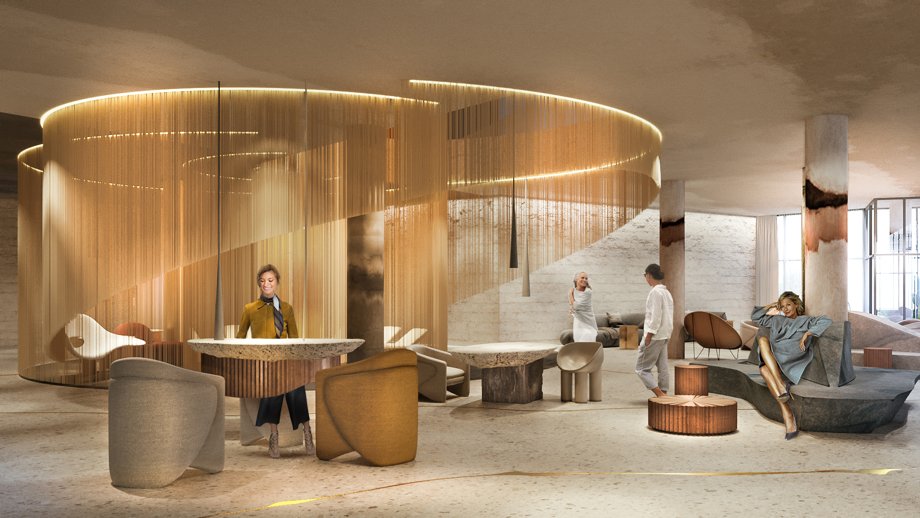
We could not ignore the popular legend about the mermaid goddess Jurata, who the resort is named after. The legend is reflected in the accents, details, and elements of the interior, intended to highlight the local history and the town’s association with the legend. Small speckles of amber and its various allegories can be found in the reception desks and the seashell-shaped Ladies Parlor, as well as in the decorations of the lobby and the bar.
We propose using natural materials in order to emphasize the specific location of the hotel, the meditative character of the resort, as well as its focus on spa services and leisure for women.
The unique location allows the hotel’s guests to enjoy views of beautiful natural landscapes, as well as to participate in the life of the resort town, which is why each guest can find an enjoyable recreation activity.
Key Points of Rejuvenation
The whole idea of the space layout is built on a harmony and fusion of opposites determined by the hotel’s natural surroundings. We changed the original layout to more comfortable zoning. The bar was slightly moved and visually separated from the restaurant with its open kitchen by a uniquely shaped glass wall. The bar shape reflects the coastline. There is a sort of stela or tower, two stories tall, in the centre of the bar, symbolizing the fusion of the cold and the warm.
We left two existing hotel entrances – the main entrance from the street and the seaside entrance. This central axis helps emphasize our concept, which is also shown in the transition from cold to warmer hues. The entrances are connected on the ceiling with art – a chameleon with cold to warm gradient links and soothes the abundance of shapes and materials of the lobby. One entrance faces the sunset, while the other nods to the sunrise.
The VIP lounge was moved to a window in a more peaceful and secluded area. Its previous location is now occupied by a unique art object – the Ladies Parlor near the Spa zone.
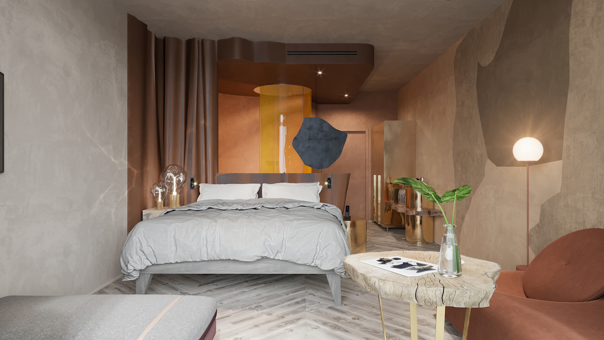
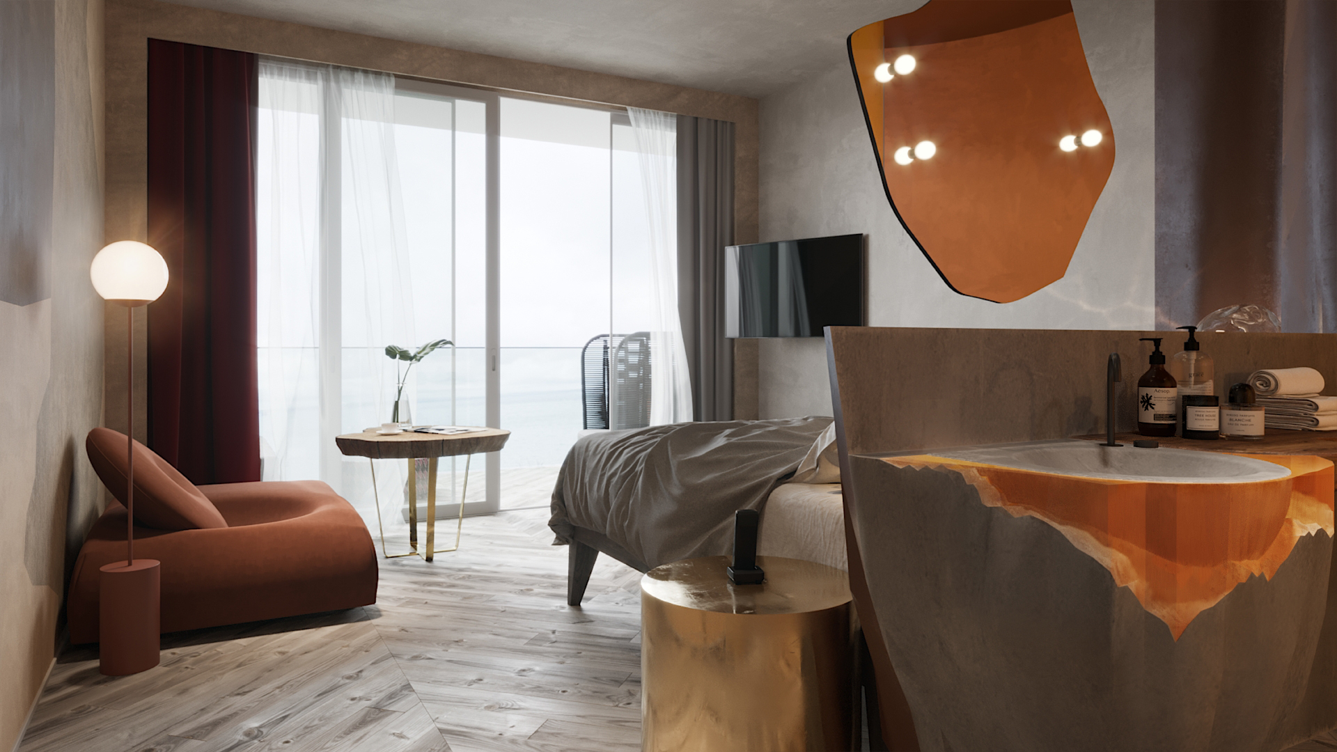
The room layout highlights the hotel’s focus on spa services. We separated the space into three functional zones: the bathroom zone, the bedroom, and the living room. The bed is positioned to allow guests to admire the view: they can open their eyes and greet the sunrise. A custom open sink and an amber walk-in curved-glass shower complements the design concept of the bathroom.
Natural materials, distinctive shapes and textures and an intricate colour palette that includes elegant cold and warm tints allow each guest to feel special. She is sure to enjoy the daily beauty rituals in esthetic interiors and feel the comfort of special bathroom elements, which she will definitely want to experience again upon returning to MGallery.
The Team:
Design by Irina and Olga Sundukovy
